With many people worldwide using mobile phones to navigate and even buy products online, it makes sense to give mobile-first design a priority. Moreover, since Google ranks for mobile-friendliness, it’s essential to bear this in mind when designing your site, don’t you think?
This same sense applies to the moment you want to add your Instagram feed to your website. Take note that horizontal Instagram feeds work excellent on desktops or tablets. However, if you think “mobile-first,” you should display your Instagram feed in a vertical layout.
In this article, I’ll show you how to design a mobile-first Instagram feed for your website using Spotlight to fully customize the way your feed looks on mobile devices.
But first …
What is a mobile-first design?
The mobile-first approach is exactly as it sounds: designing for the smallest screen and working your way up to tablet and desktop. The reasoning behind going for a mobile-first design is that you should prioritize only the most important elements to present to users.
In this regard, it is easier to progress from a more straightforward outline and functionality to more complex, desktop solutions.
Having this in mind, let’s continue to design our mobile-first Instagram feed!
How to design a mobile-first Instagram feed for your website
1. Install and activate Spotlight
Note: Before you get to Spotlight, make sure you’re logged in to your Instagram account on your desktop.
The first step is to install the Spotlight plugin. You can find the free version on the WordPress plugin repository. Go to Plugins > Add New and search for Spotlight in the search bar:
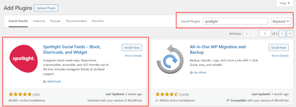
Click on the Install button, followed by Activate.
2. Connect your Instagram account
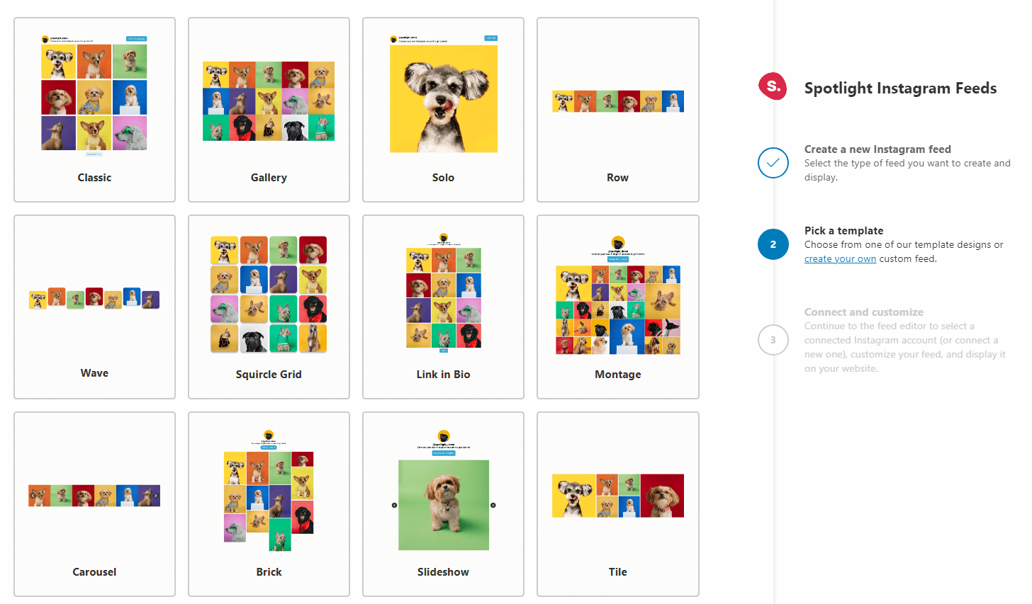
After you activate the plugin, proceed to create your new feed. First, choose the type of feed you’re creating.
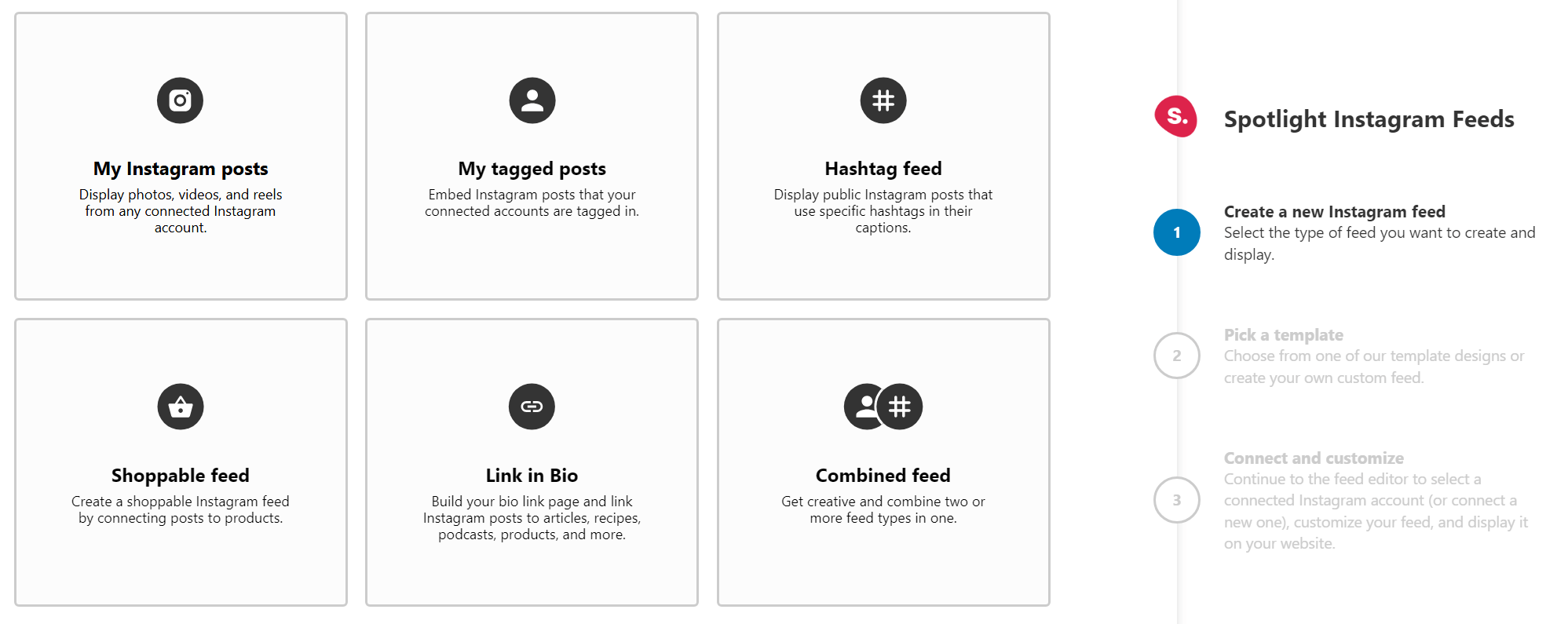
Next, pick a template. Note that you can always adjust the template at a later stage.
Finally, connect your account. To do this, click on the button that says Connect more Instagram accounts and select the type of connection you want to set up:
Note that you can only connect Instagram Professional (Business or Creator) accounts with Spotlight. You’ll need to select either a Basic or Advanced option when connecting your professional Instagram account.
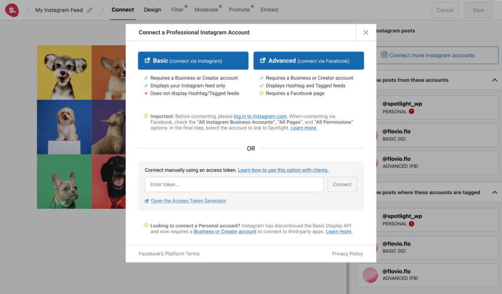
The difference between a Basic and an Advanced account is that a Basic account connects your professional account directly to Spotlight through Instagram, doesn’t require a Facebook Page, but doesn’t support hashtags or tagged feeds.
In contrast, an Advanced account requires your professional Instagram account to be linked to a Facebook Page before connecting it to Spotlight and gives you access to more features than a Basic account
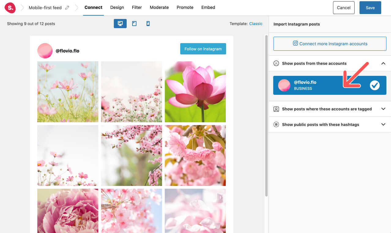
After connecting the account, you should see a live preview of your published posts:
Check out that beautiful Instagram feed that has taken you so long to build and optimize and let’s continue to design your mobile-first feed to highlight your best pictures when navigating your website from a mobile device!
4. Design your feed for mobile
The next step is to head over to the Design tab to start customizing your Instagram feed. Notice that Spotlight is not only fully responsive, but it’s one of the only plugins that allows you to generate your feed according to your device.
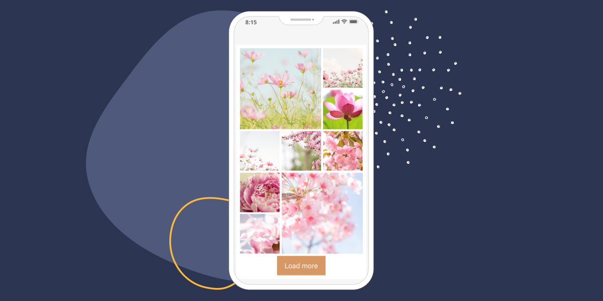
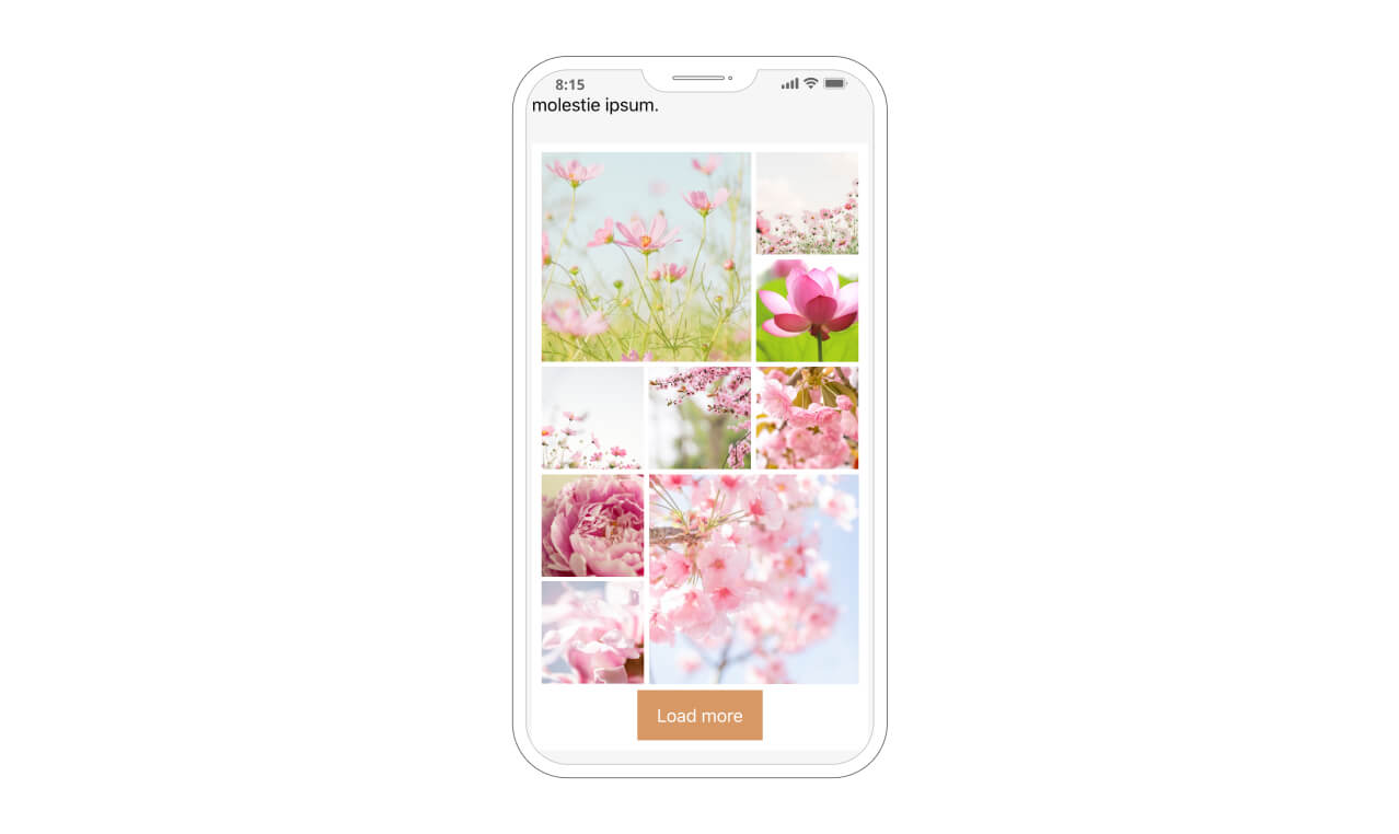
To start designing a mobile-first Instagram feed, select the phone device on the top of the sidebar. In no time, your feed will show in a vertical layout:
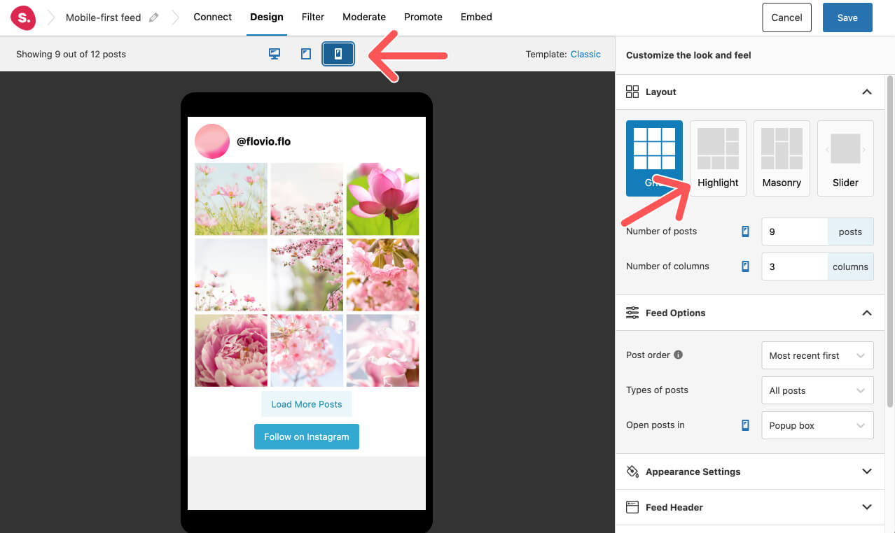
Head on over to the Layout section in the sidebar. You can try out different layout styles using Spotlight PRO.
Below, in the sidebar, you will also find the Feed section to adjust the number of posts and columns to display.
Furthermore, there is a wide range of options to customize: you can order your photos by date and popularity and determine whether posts are open in a new or existing tab or a pop-up.
I opted for the Highlight layout to create a combination of larger and smaller Instagram posts on this feed. I also went for a 3-column and 9 posts layout for my mobile-first design.
Pro Tip: Having too many columns results in tiny pictures on any mobile device. For this reason, when designing an Instagram feed for your phone, go for a 3 column layout similar to the original Instagram app design.
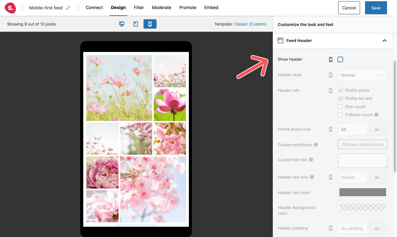
Another way to prioritize the beautiful images from your Instagram feed is by removing any elements that can distract visitors from your feed. I recommend you to go to the Header section in the sidebar and uncheck the box to remove your user name and profile picture:
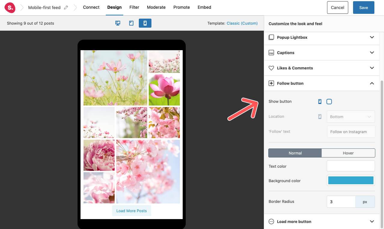
Moreover, if you really want to focus on a mobile-first design, we also suggest that you remove the Follow button. To do so, go to the Follow button section in the sidebar and uncheck the box:
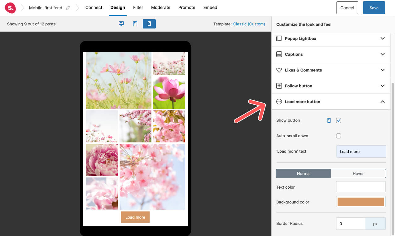
You can replace this option with the load more pictures button. We all know that Instagram is designed as a “never-ending” feed, so if you want to give users this possibility, go to the Load more button option and check the box to activate it.
This plugin is rich with features and customization options, so if you want to optimize your design further, you can go to the Appearance Settings section. Within this menu, you will find opportunities to adjust your feed width and height. You can also change the image spacing and text size of your Instagram handle and buttons.
Additionally, you can choose your feed’s background color and decide if you want to show the number of likes and comments.
Pro Tip: After you design your Instagram feed for mobile devices, change any setting to ensure that your feed looks perfect on desktop and tablet devices. By clicking each device, you can switch between them and adjust your settings accordingly. Make sure your Instagram pictures look perfect on every device, and don’t forget to save all the settings you make!
5. Filter, Moderation, and other Pro features
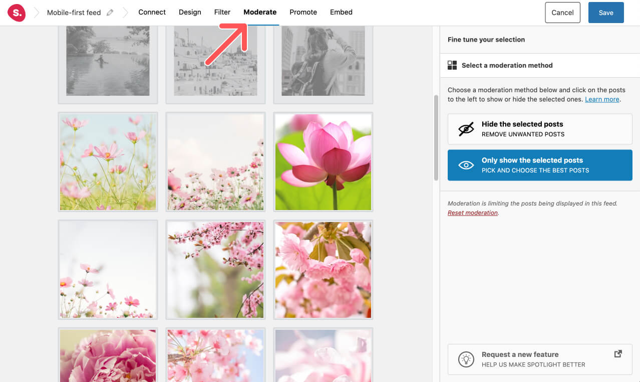
Upgrading to Spotlight PRO also gives you two more ways of curating your Instagram feed through Filtering and Moderation.
These options are ideal if you want to hide or highlight posts with certain words or phrases. In the same way, you can also manually select the specific posts you want to hide or only show the pictures that you choose.
Moreover, in the Promote section at the top of the screen, you can add links to promote your blog posts, landing pages, WooCommerce products, and much more through your Instagram feed.
6. Embed your mobile-first Instagram feed anywhere on your site
Now that you have your Instagram feed ready, all you need to do is embed it on your website.
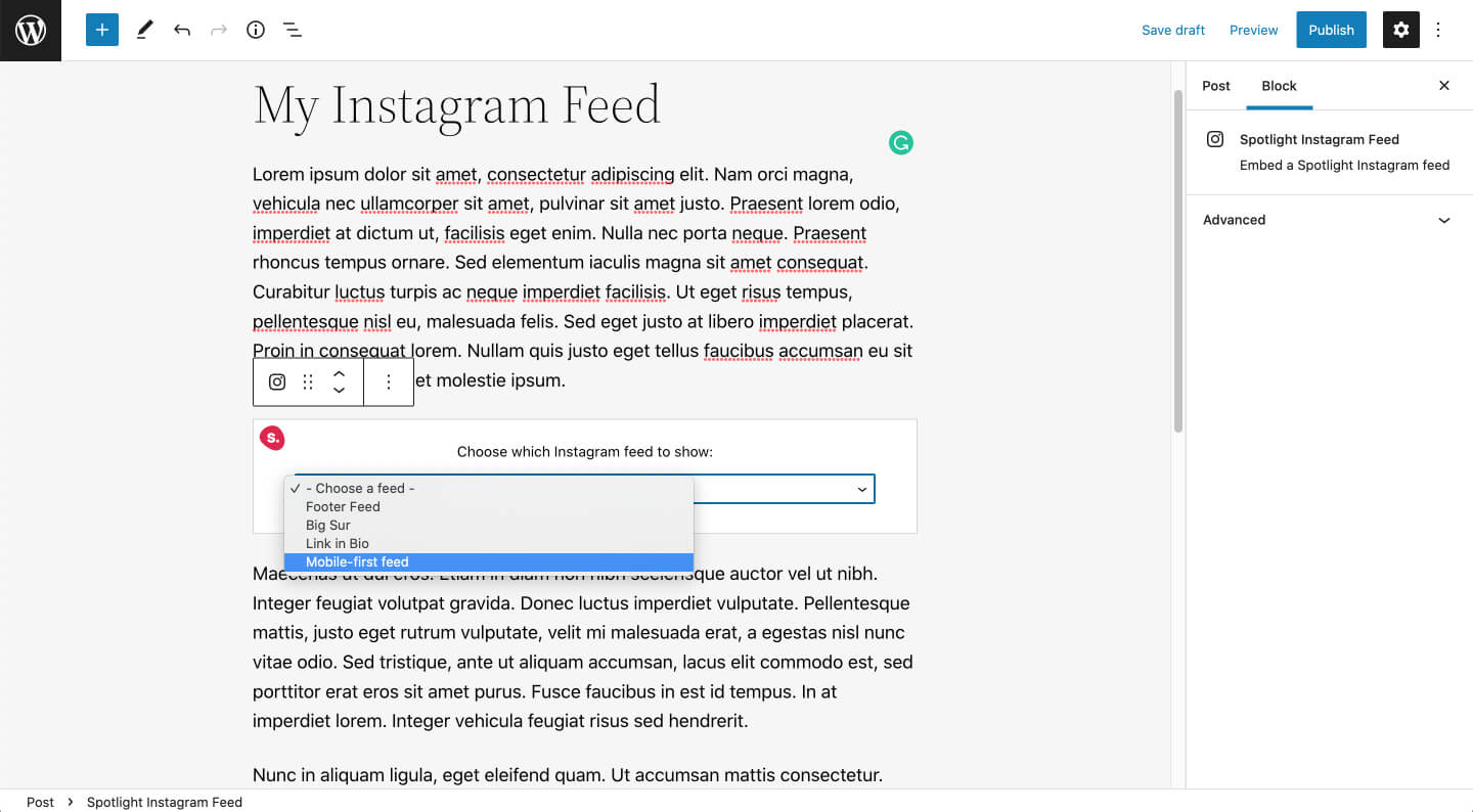
To display your feed within a blog post, go to the article and add a the Spotlight block in Gutenberg and select the feed you want to display.
If you are using a page builder such as Elementor or displaying your Instagram feed as a widget, you need to copy and paste the shortcode to add your feed to any section. You can also use the Spotlight Elementor block.
Fall in love with your final result because your Instagram feed is now live and completely mobile-friendly!
Conclusion
Neglecting mobile design in this age is like committing a UX design sin. In this regard, delivering an excellent user experience on mobile devices — or on all devices — should be at the heart of your site’s design strategy. Use Spotlight and Spotlight PRO to enhance the experience you provide to your website’s visitors.
By embedding an optimized Instagram feed to your site, users will not only be attracted to finding out more about your account but will also seek to learn more about what you offer. We promise they will appreciate it!
Designing a mobile-first feed in WordPress only takes minutes with Spotlight PRO. We are currently adding more features to this well-designed and easy-to-set-up plugin, available to all Social Media lovers or anyone who uses Instagram at the core of any business strategy.
Have you used Spotlight to design a mobile-first Instagram feed for your website? Let us know in the comments section below.
