When you’ve worked on creating a strong Instagram feed for your brand or project, it only makes sense to carry on your work onto your website.
Adding an Instagram feed to your website is made easy with an Instagram feed plugin such as Spotlight. However, it is important that you showcase it in a way that works with your website’s aesthetic and design.
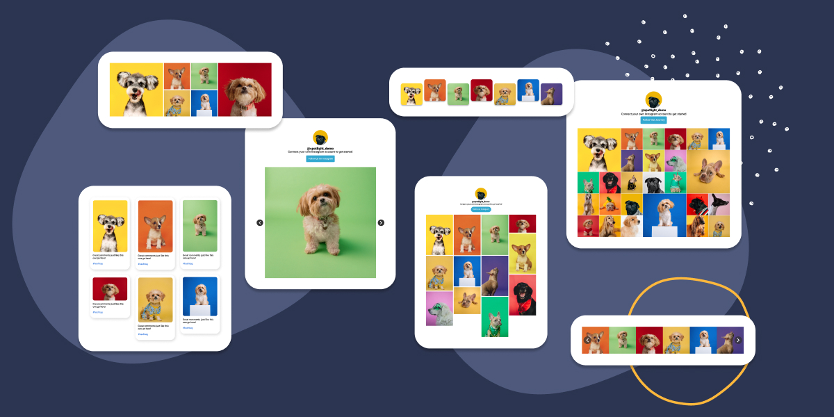
Spotlight offers you 14 different pre-made Instagram feed layouts to help make this possible. In this article, we’ll be looking at each one in detail.
Let’s get started.
Create stunning Instagram feeds on your website. Start with any template or design your own
Why it’s important to choose the best Instagram feed layout for your website
Aesthetics are extremely important when it comes to an Instagram feed. Just as a good feed layout on Instagram gives someone who follows you for the first time a good idea of your brand, so does the Instagram feed layout on your website.
To add to that, where you place your Instagram feed makes a huge difference. Adding a grid layout in your footer, might seem like the good choice, but a horizontal feed would create a more cohesive look.
Remember, your Instagram feed is your first impression of your work to any potential client or follower. So spending a little bit more time fine-tuning your layout can make a world of a difference.
As Hootsuite puts it, “anyone viewing your profile is thinking about following you. This is your chance to show exactly what you offer.”
In this next section, we’ll take a look at the 14 most common Instagram feed layouts for you to try on your website.
1. Classic Grid
A classic grid is great for consistency. It takes the “Instagram approach” of a 3×3 grid – perfect for landing pages. This layout provides you with a clean, organized look that gives viewers an at-a-glance summary of your Instagram content.
2. Gallery
If you’re a creative using your Instagram feed as a gallery, then Spotlight’s dedicated template will work beautifully for you. The Gallery layout will allow you to showcase a collection of images that could be displayed in a more dynamic format, with the option of clicking and expanding each image. Use this layout as a full-page Instagram feed to create an interactive experience, encouraging viewers to engage with multiple pieces of your content.
3. Montage
Got lots of posts to show? A montage is great solution to showcase multiple Instagram posts in one feed. Create a rich and layered visual experience that tells a more complex story.
4. Carousel
Carousels are a great horizontal alternative to the typical grid. Use this in footers or horizontal sections all over your website to diplay multiple Instagram posts in a sliding carousel format. Engage your viewers with a narrative or series of posts without taking up much space on your website.
Tutorials:
How to Add an Instagram Carousel to WordPress
How to Set Up an Instagram Testimonials Carousel in Elementor
How to Add an Instagram Slider to Your Website [2 Minutes]
5. Slideshow
Guide viewers through your brand with the Slideshow layout. Create a PowerPoint-like presentation that showcases your Instagram posts, one at a time.
6. Row
Display your Instagram posts in a row – the perfect accompanyment for your WordPress footer. This layout gives you the opportunity to display as many Instagram posts as you like in a horizontal fashion.
Tutorials:
How to Add a Horizontal Instagram Feed in WordPress (in 4 ways)
How To Add an Instagram Footer Feed to Your WordPress Blog (Easy Way)
7. Link in Bio
Create a link in bio page that showcases your most recent posts with the Link in Bio layout. Drive traffic from your Instagram account to your website and other pages through your Instagram content.
Tutorials:
Spotlight: A Self-Hosted Linktree Alternative
How to Create a Link in Bio Page Using WordPress
8. Portfolio
The Portfolio Instagram feed layout is ideal for artists, designers, photographers … you name it! It creates a professional-looking display of your best work, complete with captions to add some context to your Instagram posts.
9. Tile
Tired of the 3×3 Instagram layout? Switch things up and create a visually consistent and rhythmic feed with the Tile layout.
Tutorial:
How to Display Instagram Testimonials on Your Website (in 5 easy steps)
10. Solo
Focus on one Instagram post in a large, prominent format to tell your story. The Solo layout is the perfect way to focus on a single piece of content, giving it more impact.
11. Wave
The Wave layout arranges your posts in a staggered, wave-like format. Impress your viewers with a dynamic and visually engaging feed that stands out from more traditional layouts.
12. Brick
Showcase your Instagram posts in a masonry-style layout, with different sizes and shapes resembling bricks in a wall. This layout gives viewers a unique and varied look that breaks the monotony of uniform grids. Plus, it showcases your Instagram posts in full!
13. Squircle Grid
Is that a square or a circle? The Squircle is a shape that’s just between the two! This layout gives you a modern, but softer look compared to the classic grid format.
14. Zoom
Step things up a notch with the Zoom Instagram feed layout. Zoom allows for a zoomed-in view of your images when hovered over. Create a detailed and immersive viewing experience that reveals more about each post.
Conclusion
In conclusion, Spotlight offers a variety of beautiful and engaging layout options that are tailored to suit different content and website styles. From the organized aesthetic of the Classic Grid to the dynamic appeal of the Wave layout, the creative possibilities are endless.
The Brick and Tile layouts add a sense of rhythmic design, while the Portfolio layout offers a professional display for showcasing your work. With interactive options like the Carousel and Slideshow layouts, your website visitors can explore your content in an immersive way. Lastly, unique features like the Squircle Grid and Zoom layouts ensure your feed is not only visually engaging but also stands out from the crowd.
Remember, the choice of layout should be aligned with your overall brand image, the nature of your content, and the preferences of your audience. Don’t be afraid to experiment with these options and monitor the impact on your website’s user engagement.
After all, in this digital age, flexibility and adaptability are key to maintaining an engaging online presence.


