Do you want to display your Instagram feed on your website and ensure it looks great on all devices? With mobile internet usage on the rise, it’s important to ensure that your website is responsive and easy to use on all devices, including smartphones and tablets.
If you’re using WordPress, you’ll want to make sure you choose plugins that are built with responsiveness in mind. Luckily, Spotlight is a plugin that does just that. It’s a responsive Instagram feed plugin that ensures your feed looks great on all devices, without requiring any coding skills from you.
One of the best features of Spotlight is that it allows you to design your Instagram feed differently depending on the device your website is being viewed on. This means that you can make sure your feed looks its best on every screen size, without sacrificing any functionality or user experience.
In this tutorial, we’ll show you how to design a responsive Instagram feed for your WordPress website using Spotlight. Whether you’re a beginner or a seasoned WordPress user, you’ll be able to follow along and create a beautiful, mobile-friendly Instagram feed in no time.
Step 1: Setting up your feed
For the purposes of this tutorial, I’ve assumed that you’ve got Spotlight installed and set up on your WordPress site and you’ve connected your Business or Creator accounts to either a Basic or Advanced account in Spotlight (or pasted in an Instagram access token if you’re connecting on a client’s behalf)
If you would like a more in-depth tutorial, see how to add an Instagram feed to WordPress first, or check out our post on how to create an Instagram gallery in WordPress.
The first and most essential thing to figure out is where your feed is going to be shown on your website. Designing a feed for a sidebar is very different from designing a feed for a footer.
Once you’ve decided on the placement of your feed, you can begin creating a new feed by clicking on the Create new feed button on the Feeds page. It’s a simple process that involves just three easy steps, which we’ll guide you through below.
Once you’ve created your Instagram feed and selected your Instagram account, go to the Design tab.
One of the best features of Spotlight is its live interactive preview, which displays your Instagram feed in real time as you make design customizations. This means that you can see exactly how your feed will look once it’s embedded on your website, without having to switch back and forth between different windows or tabs.
As you make design customizations, the live preview customizer will automatically update itself, giving you a clear and accurate picture of how your feed will look on your website. This makes it easy to experiment with different design options and find the perfect look for your Instagram feed.
In the next section, we’ll go over some of the key design customizations you can make with Spotlight to create a beautiful and responsive Instagram feed for your WordPress website.
Step 2: Design a responsive Instagram feed
To design a responsive Instagram feed, Spotlight has a dedicated section at the top of the feed preview area. Click on the desktop, tablet, or phone icon, and Spotlight will automatically take on your previous design options and show you what your feed will look like on any device.
When you’re designing your Instagram feed with Spotlight, you may notice that some settings are automatically adjusted for tablets and phones to ensure optimal display on all devices. These presets are designed to work out of the box, but you can also customize them further if needed.
With Spotlight’s built-in responsiveness, you can rest assured that your Instagram feed will always look great, no matter how your visitors are viewing your website. In the next section, we’ll go over some of the key design customizations you can make to create a unique and visually stunning Instagram feed for your WordPress website.
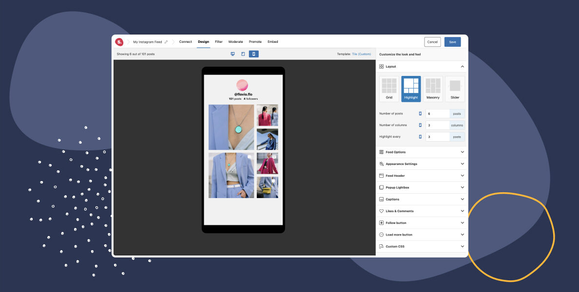
Change column settings while on tablet or mobile
While a 4 or 5-column layout can work great on desktop, switching to smaller screens results in much smaller images. To mitigate this, Spotlight lets you change the number of columns for each device.
To do so, click on the tablet or phone icon at the top of the preview area, go to the Layout section, and change the number of columns, the number of posts shown, and in the case of the “Highlight” layout, as seen above, you can also change how often to highlight a post.
Pro tip: We suggest not going beyond 4 columns for tablets and 3 columns for phones.
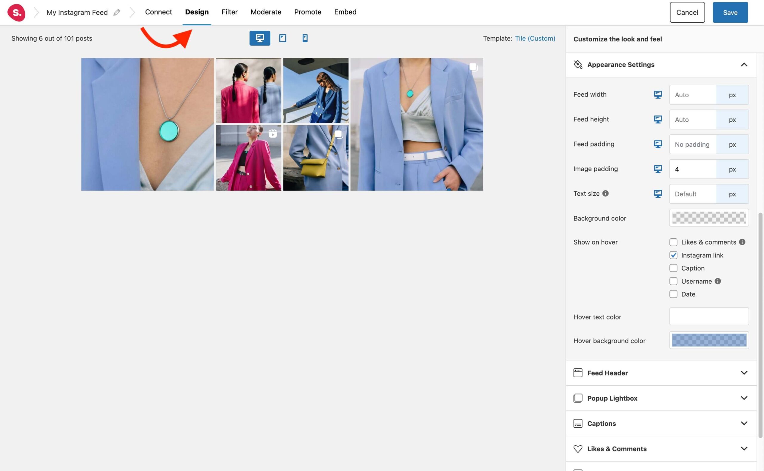
Adjust outside and image paddings
Adding generous spacing around your images lets the whole layout breathe. The importance of blank space in design is not one that should be overlooked, even when creating a responsive Instagram feed.
However, problems tend to arise on mobile devices. Here you don’t have the luxury of allowing for so much ample space around your images. For this reason, Spotlight provides you with the ability to set different outside and image padding for each device.
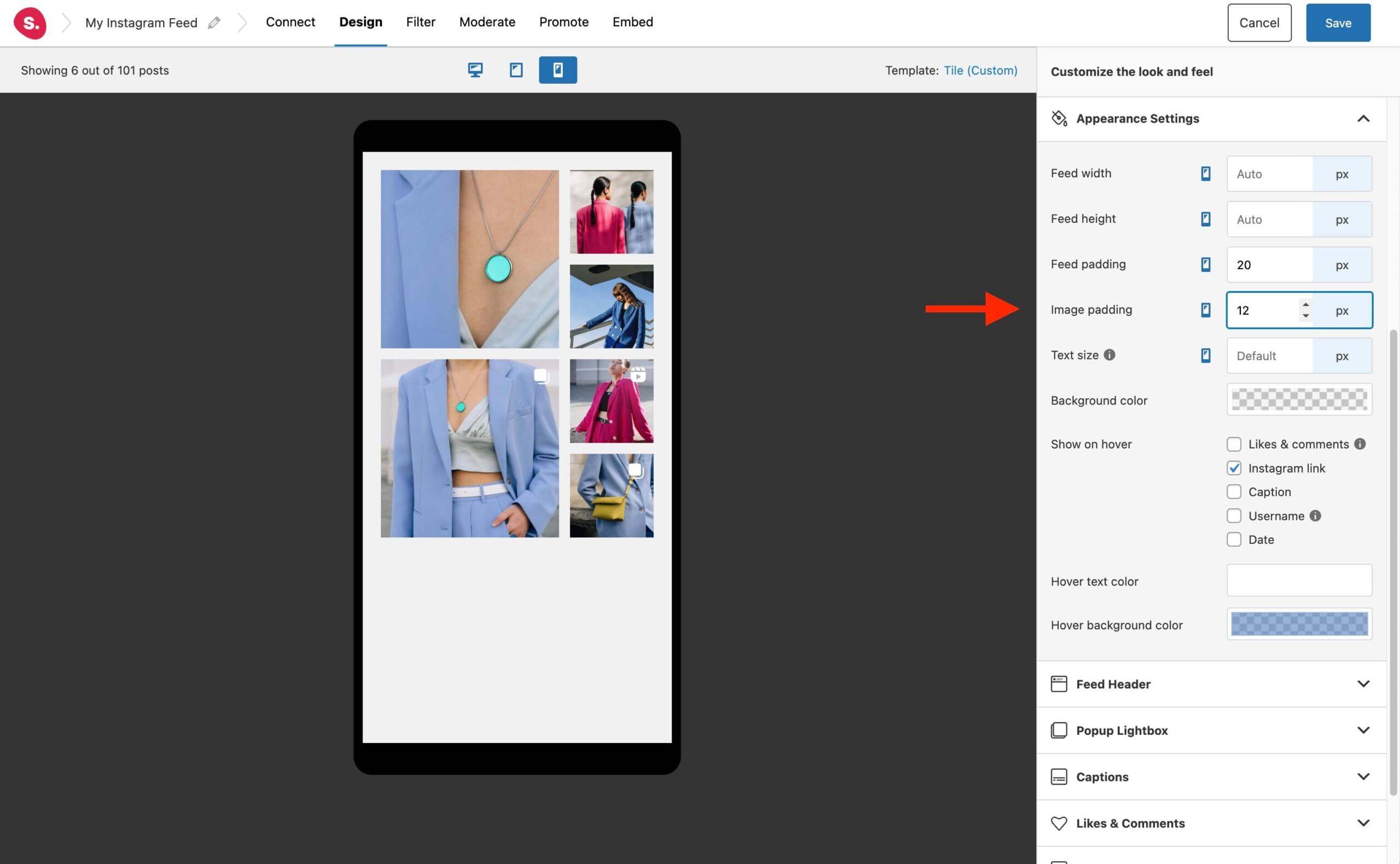
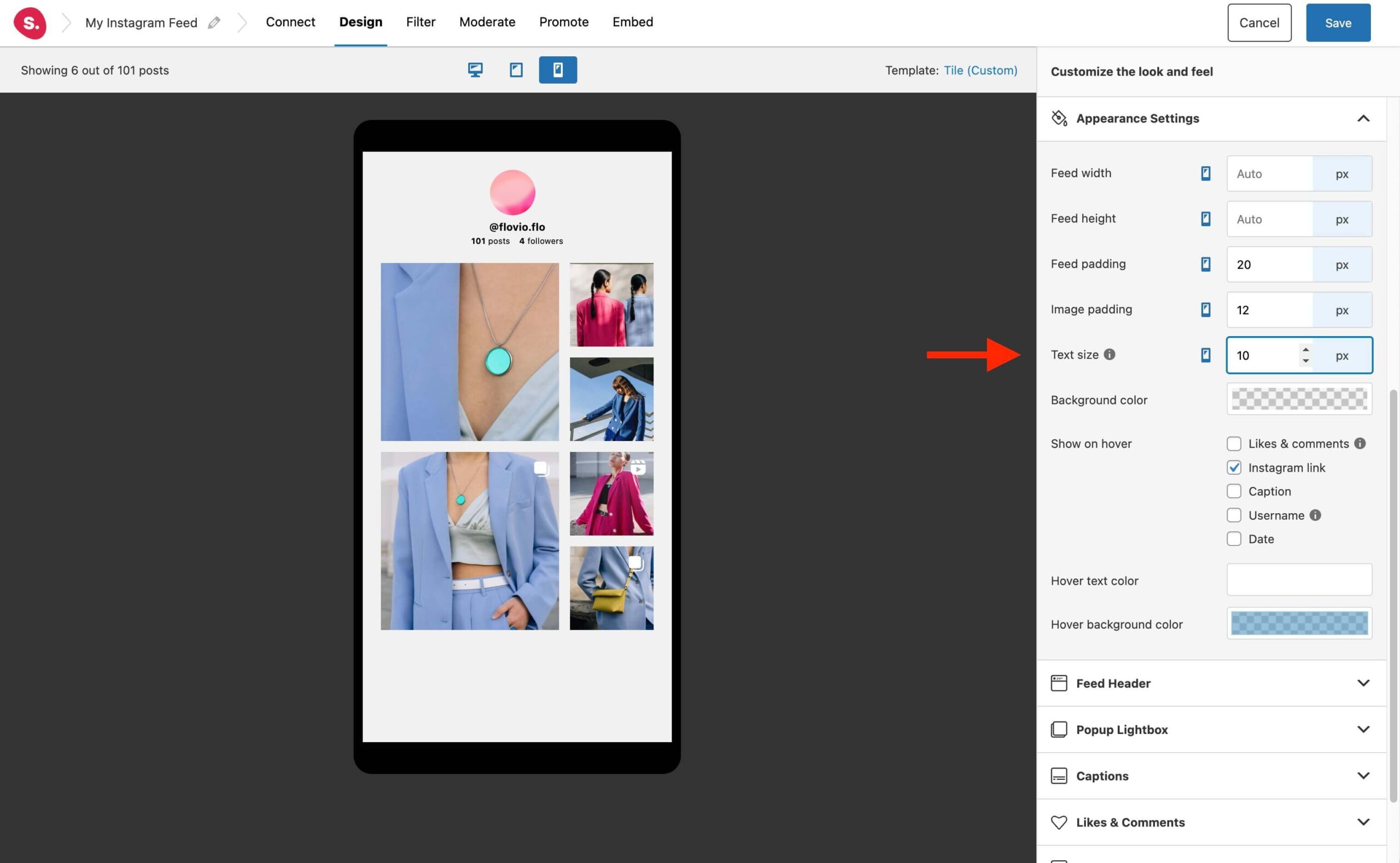
To edit these settings, go to the Appearance Settings section and adjust the outside and image padding accordingly for each device.
Beautify your typography and styling
Spotlight is designed to seamlessly integrate with your website’s current theme, including fonts. All of the text in your Instagram feed, from headings to captions and buttons, will use the fonts from your theme.
While the font is automatically applied, you can still customize the size of your feed text to ensure optimal display on all devices. For example, you may want to create an attention-grabbing header with a text size of 18px, but this could be too large for mobile devices.
With Spotlight, you can easily set different font sizes for tablets and mobile devices, ensuring that your text looks great on any screen size. To adjust your font sizes, simply go to the Appearance Settings tab and customize your settings for each device.
Additionally, Spotlight’s default responsive design enables headers to go from default on desktop and tablet to centered on mobile. Since we don’t have the luxury of having much real estate on mobile devices, the central header looks much better.
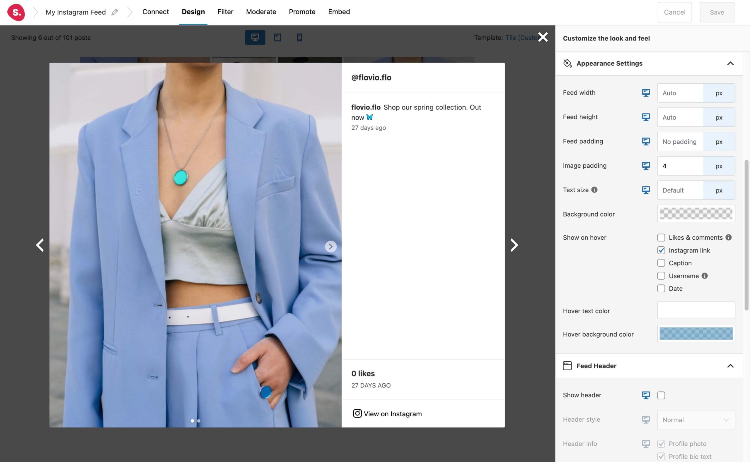
Open posts in a lightbox
One final step you need to look out for is the way your posts will react once a visitor clicks on them. For desktops and tablets, we suggest opening up the images in a popup lightbox as seen below.
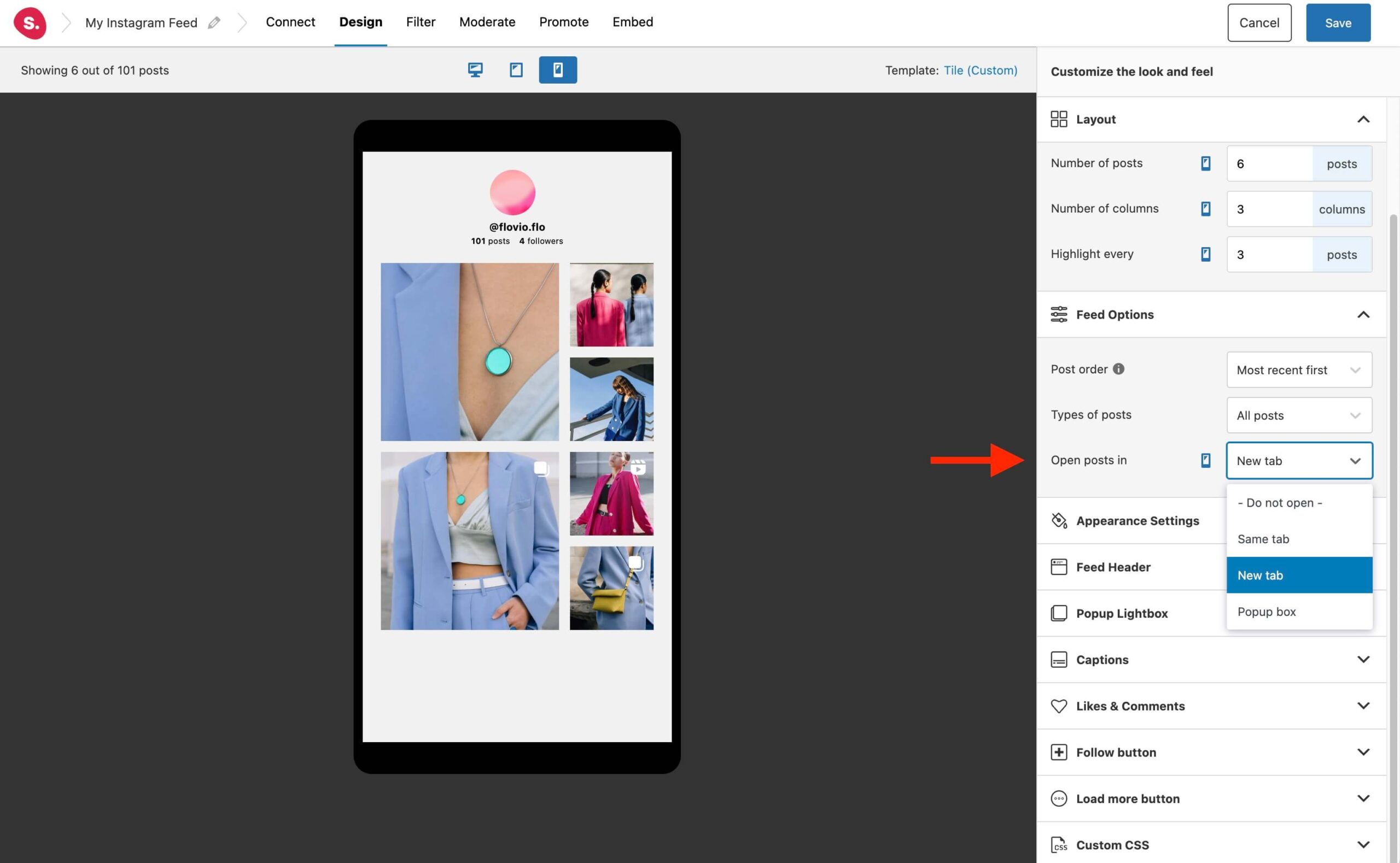
For mobile phones, to keep with the theme of a responsive Instagram feed, you can choose to open up your images directly on the Instagram app, giving your visitors a better experience.
To do so, set posts to open in a new tab from the Feed Options, and site visitors who have the Instagram app on their phone will be taken directly to it. Spotlight does that for you out of the box, which can help to boost your Instagram follower count.
Conclusion
To sum up, designing a responsive Instagram feed is crucial for ensuring a great user experience on all devices. With Spotlight, you can easily create a responsive Instagram feed within your WordPress dashboard. Here’s a quick checklist to ensure your Instagram feed is optimized for all devices:
- Check the number of columns to ensure posts aren’t too small on mobile devices.
- Adjust outside and image paddings to ensure the right amount of space around posts and feed.
- Customize text size for each device to avoid any text being too large for mobile devices.
- Consider changing the setting for opening posts in a new tab instead of using a popup box for mobile.
By following these simple steps, you can be sure that your Instagram feed will look great and function seamlessly on all devices. So, go ahead and create a stunning and responsive Instagram feed for your website using Spotlight.
