Are you looking for a way to add a horizontal Instagram feed to your WordPress website?
Horizontal Instagram feeds are some of the most popular forms of displaying your Instagram posts on a WordPress site – and for good reason. They integrate perfectly within footers and act as great section dividers on individual pages.
In this post, I’ll take you through the steps to create and display a horizontal Instagram feed in WordPress – in 4 different ways.
Let’s get to it!
Why add a horizontal Instagram feed?
A horizontal Instagram feed can be a game-changer for your website. Not only does it add a visually stunning element to your site, but it can also help to increase engagement and encourage visitors to explore your content further. By displaying your Instagram posts in a horizontal format, you can make your website more dynamic and engaging, creating an immersive experience for your visitors.
One of the main benefits of a horizontal Instagram feed is that it can help to establish your brand’s social media presence. By showcasing your Instagram content directly on your website, you can demonstrate the quality of your social media activity to potential customers or clients. This can help to build trust and credibility, as well as create a more cohesive brand identity.
Another advantage of a horizontal Instagram feed is that it can help to keep your website fresh and up-to-date. By automatically pulling in your latest Instagram posts, you can ensure that your website always has new and engaging content for visitors to explore. This can be particularly useful for bloggers or content creators who want to showcase their latest work or for businesses looking to promote new products or services.
How to add a horizontal Instagram feed in WordPress
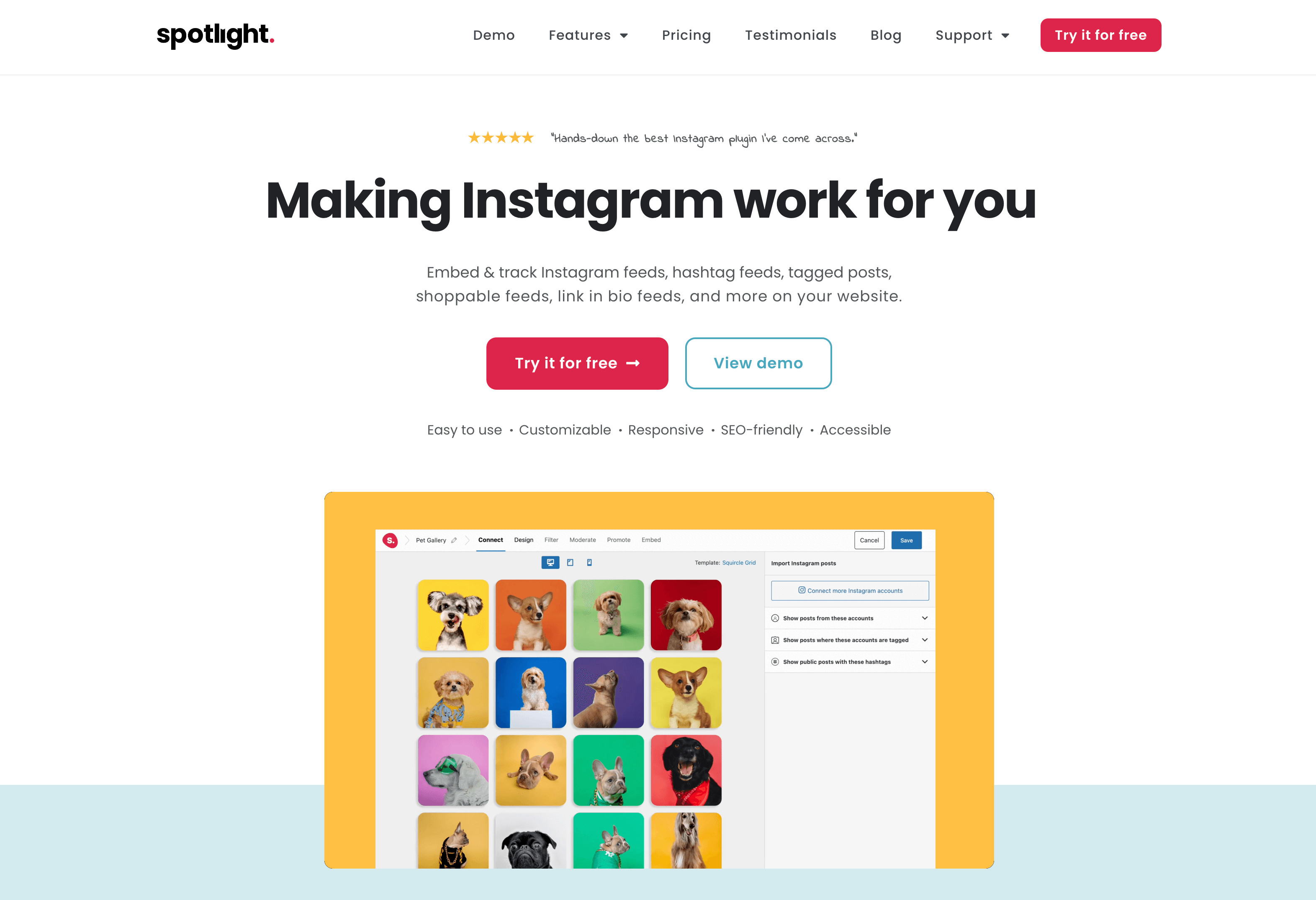
If you’re looking to add a stunning and responsive horizontal Instagram feed to your WordPress website, then look no further than Spotlight.
Spotlight offers a range of customizable and attractive Instagram feed templates, making it an excellent choice for bloggers, influencers, and businesses looking to showcase their social media content. With Spotlight, you can choose from a variety of templates and settings to create a horizontal Instagram feed that perfectly complements your website’s design.
One of the best things about Spotlight is how easy it is to use. With just a few clicks, you can connect your Instagram account and customize your feed to match your website’s style. Whether you’re looking for a sleek and minimal row layout or a contemporary wave layout, Spotlight has you covered. And with its fully responsive design, you can be sure that your horizontal Instagram feed will look great on any device, whether it’s a desktop computer or a mobile phone.
But that’s not all – Spotlight also gives you full control over your Instagram content. With the Spotlight PRO plugin, you can filter and moderate your Instagram feed to ensure that only the best content is displayed on your website. Plus, with the ability to add captions, likes, and comments, you can engage your audience and encourage them to follow you on Instagram.
Creating your horizontal Instagram feed using Spotlight
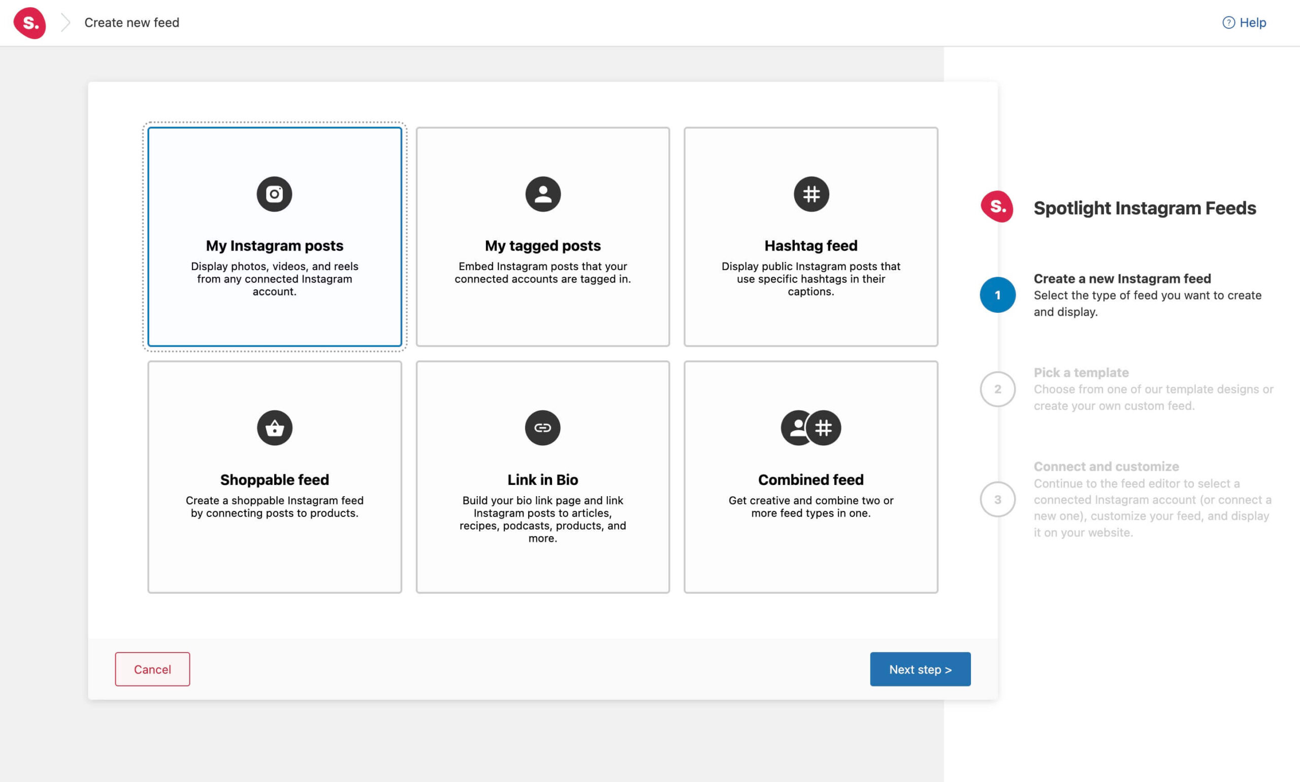
Once you’ve installed Spotlight, the first step is to create a feed and select which types of Instagram posts you would like to display.
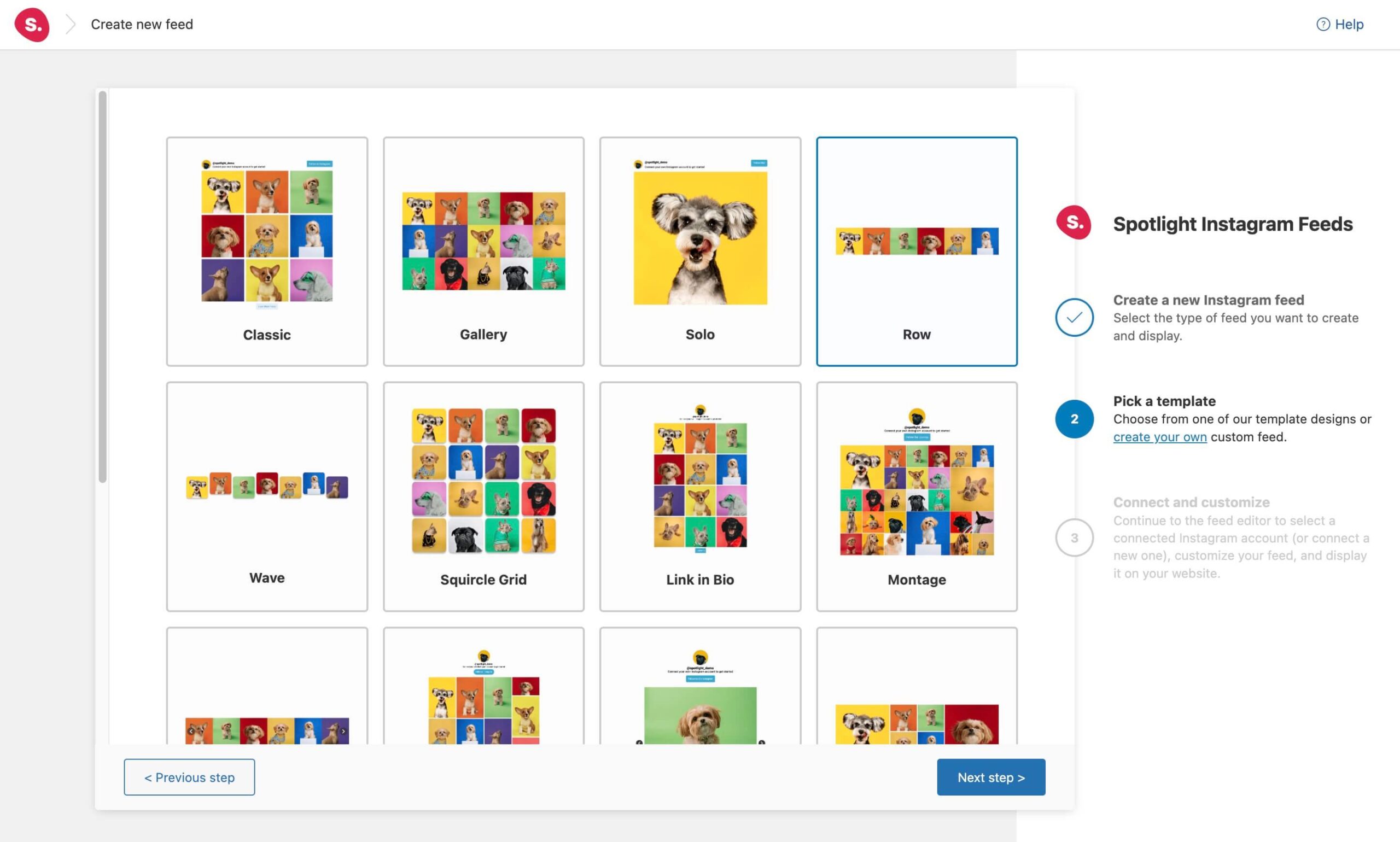
Next, choose one of the pre-made templates. We’ve currently worked on 4 templates that would work perfectly in horizontal sections. Let’s start off with the Row template.
Finally, it’s time to connect your account. This should only take you a couple of seconds to complete, but you’ll need to connect your Instagram Professional (Business or Creator) account to a Basic or Advanced account in Spotlight.
When you’re ready, select the connection method you want to use:
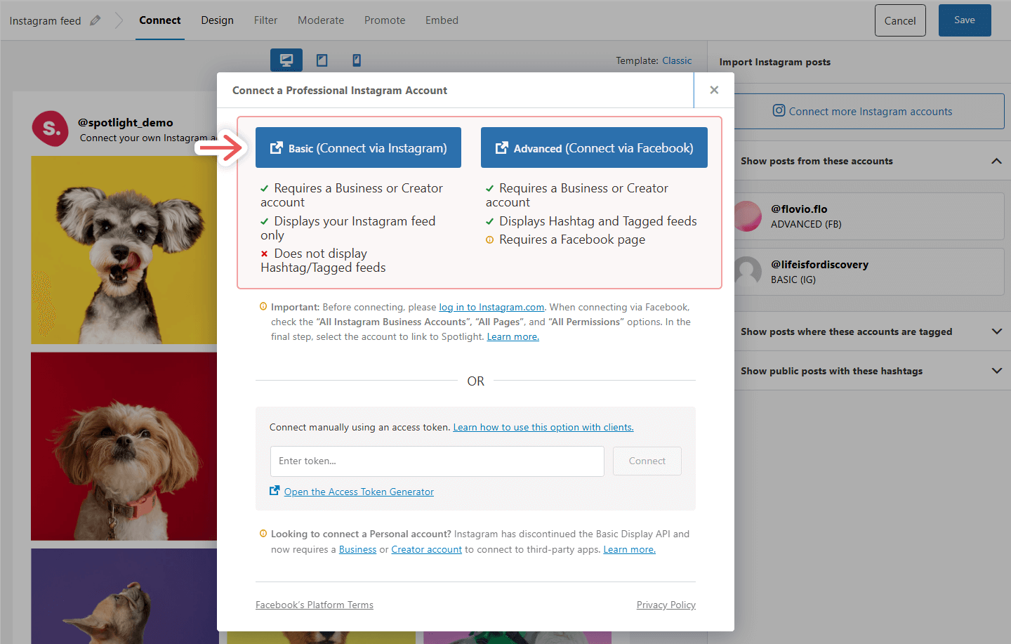
You’ll see a pop-up requesting the necessary permissions appear. Confirm the permissions and then we can start to work on the feed itself.
Horizontal Instagram feeds – 4 ways
While we’ve chosen the Row template in the previous step, you can always go back and change your chosen template by clicking on the template name on the top right-hand side of your screen.

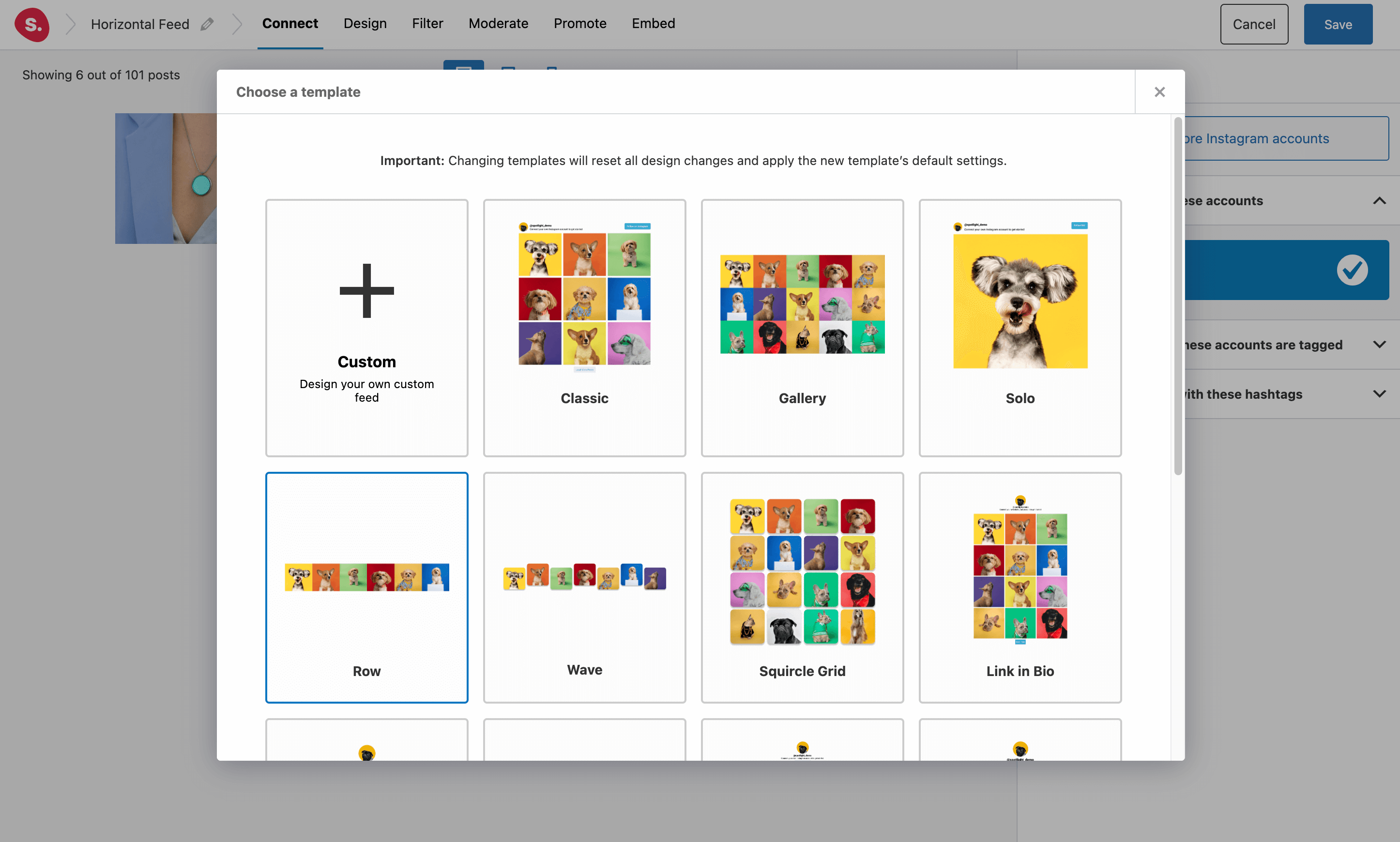
Furthermore, you can also customize the pre-designed templates in a number of ways to ensure that it matches your site’s aesthetic – more on that later.
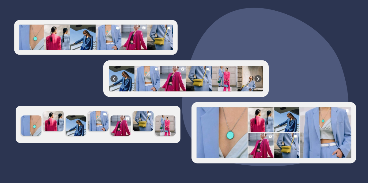
Let’s look at 4 horizontal Instagram feed templates for your website:
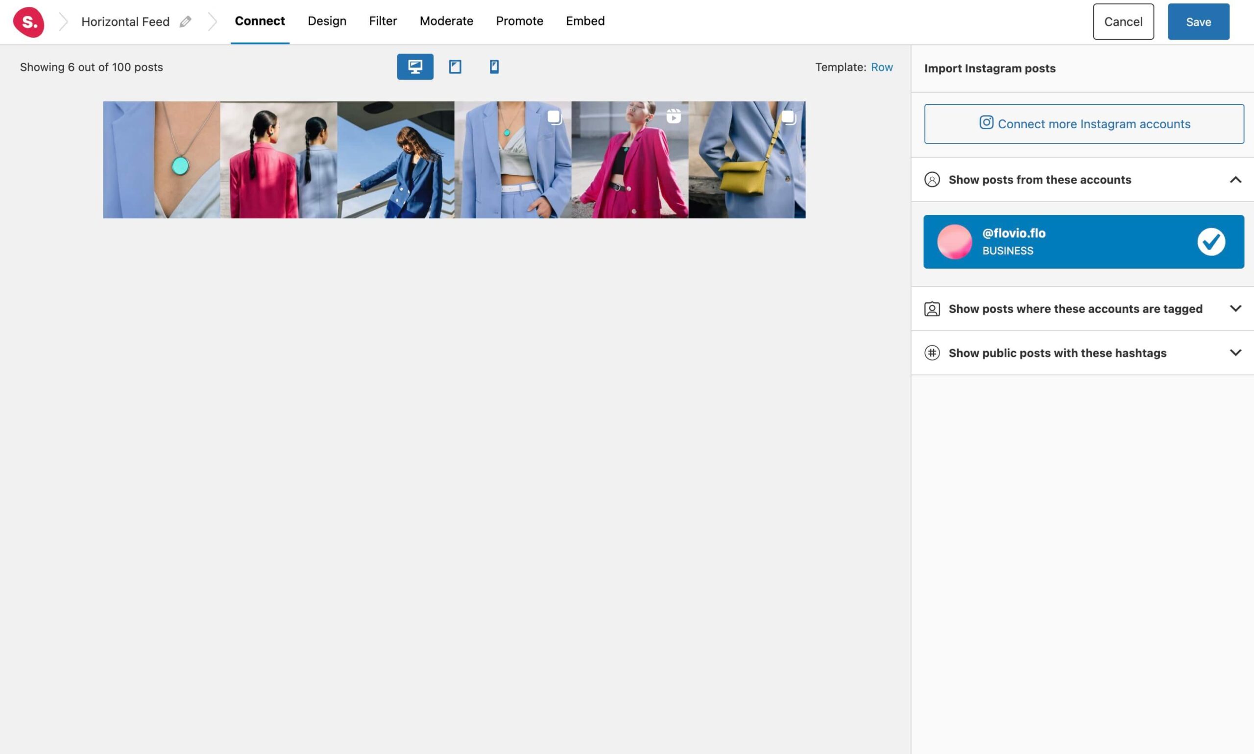
1. The Row
This type of layout is perhaps the most common out of the four. It is most commonly used in page footers across WordPress websites thanks to the consistent structure and design it offers. The row template helps you create a cohesive look and feel. By using the same template for different sections of your website, you can also maintain a uniform appearance throughout the site.
2. The Carousel
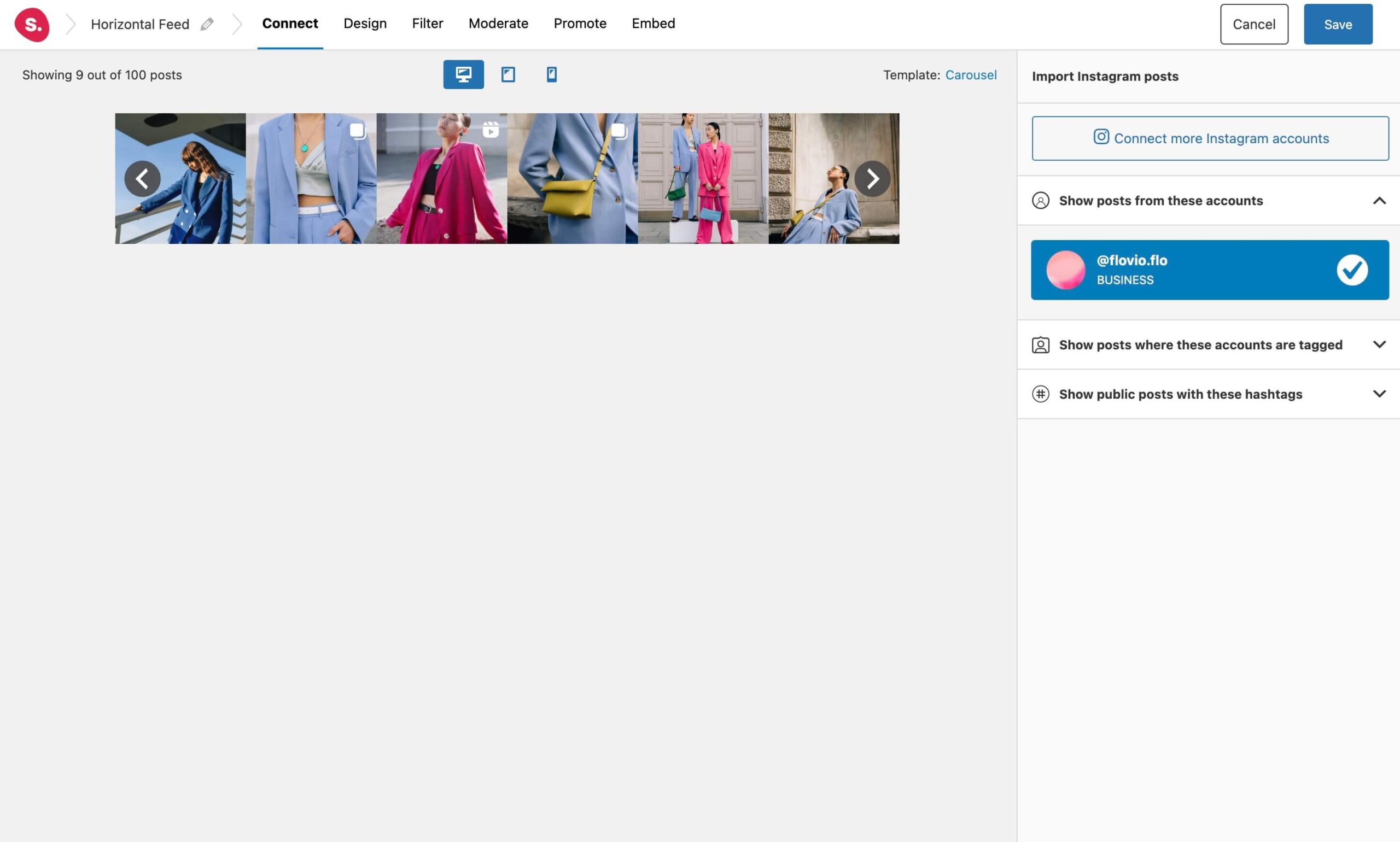
The carousel template was designed to maximize space on a webpage. It allows you to display a large number of Instagram posts within a limited space. In fact, by using a carousel, you can showcase multiple images, videos, or reels without cluttering up your website.
Carousels are also interactive and can increase user engagement on your website. The movement of the images or content grabs the attention of users and encourages them to explore more. This can also increase the time that users spend on your website, which can lead to a higher conversion rate.
3. The Wave
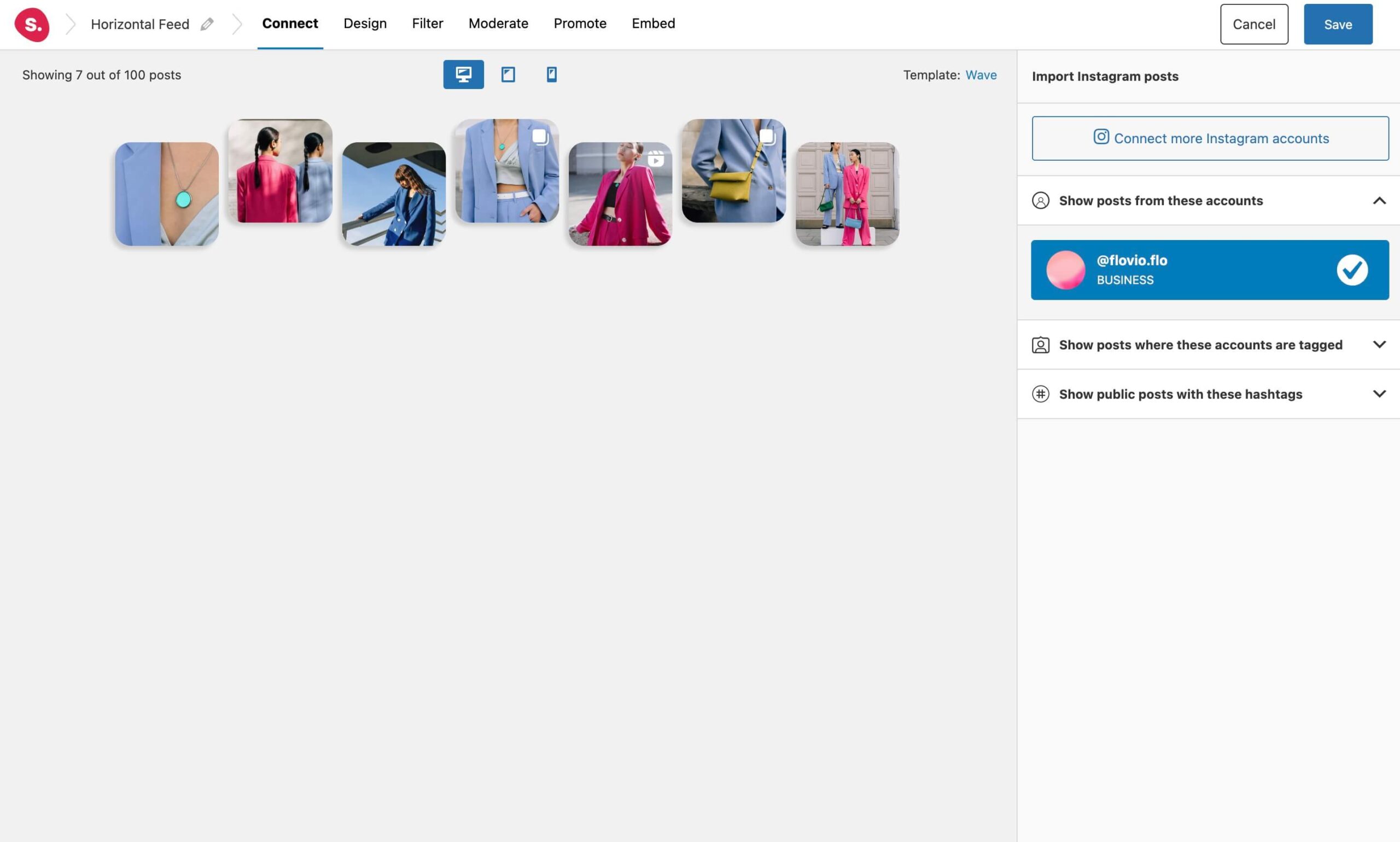
For a more fun and modern horizontal feed, opt for the wave layout. This template can add a unique and eye-catching design element to your website. The flowing, curved lines of the template can create a sense of movement and dynamism, making your website stand out from others that use more traditional designs.
The wave template can also help create a sense of movement and guide users through your website. This can make the user experience more engaging and enjoyable, encouraging visitors to stay on your site for longer and explore more of your content.
4. The Tile
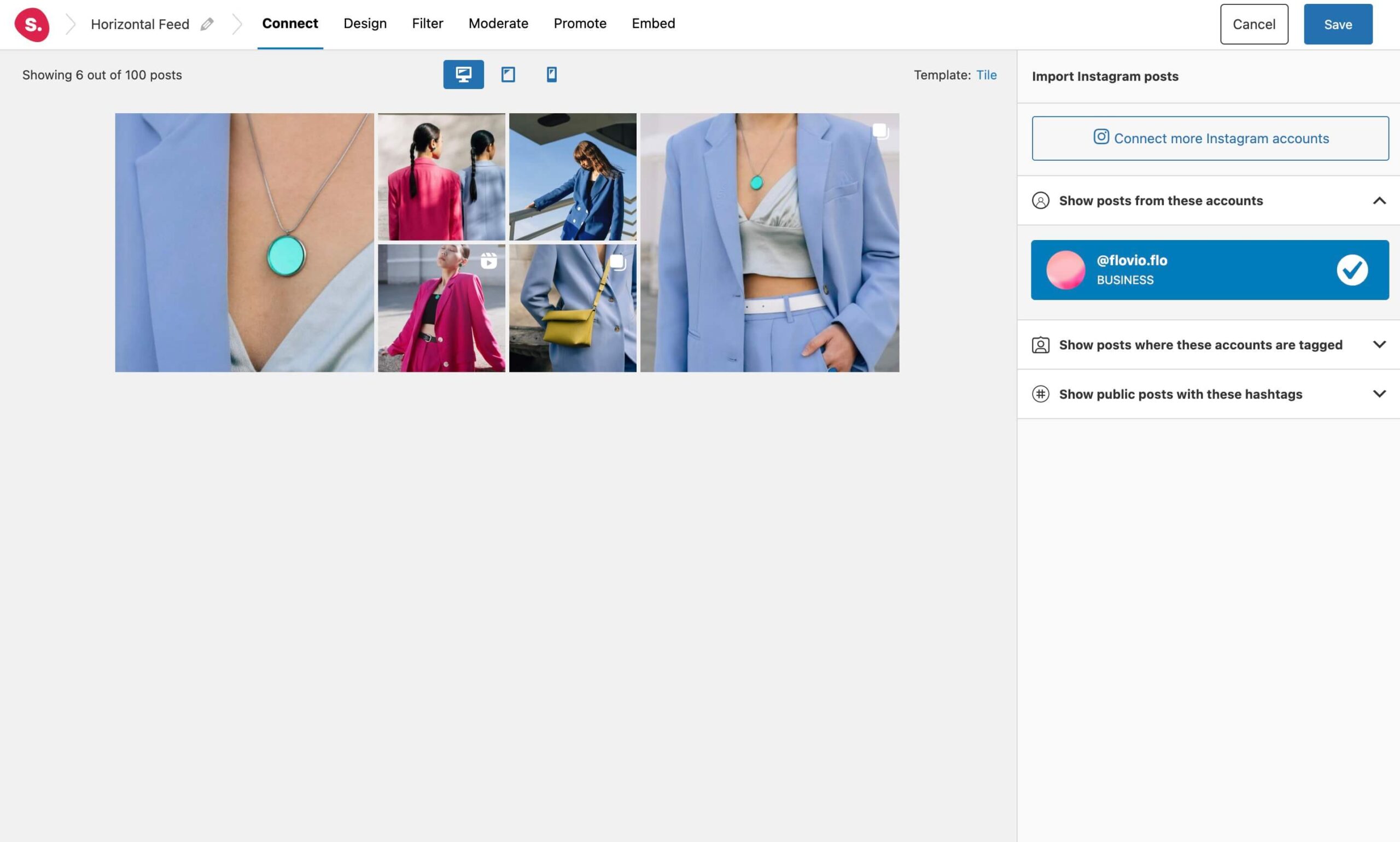
Want to attract even more attention to your feed? Try out the Tile layout to create a combination of larger and smaller Instagram posts.
The tile template is visually appealing and can make your website look modern and sleek. By arranging content in a grid-like pattern, you can create a balanced and organized look that can make your website more attractive to visitors.
Tile layouts also make it easy for users to navigate your feed and find the content they are looking for. By grouping related content together, users can quickly scan the Instagram feed and find what they need. This can improve the user experience and reduce bounce rates.
How to further customize your horizontal feed
Responsiveness
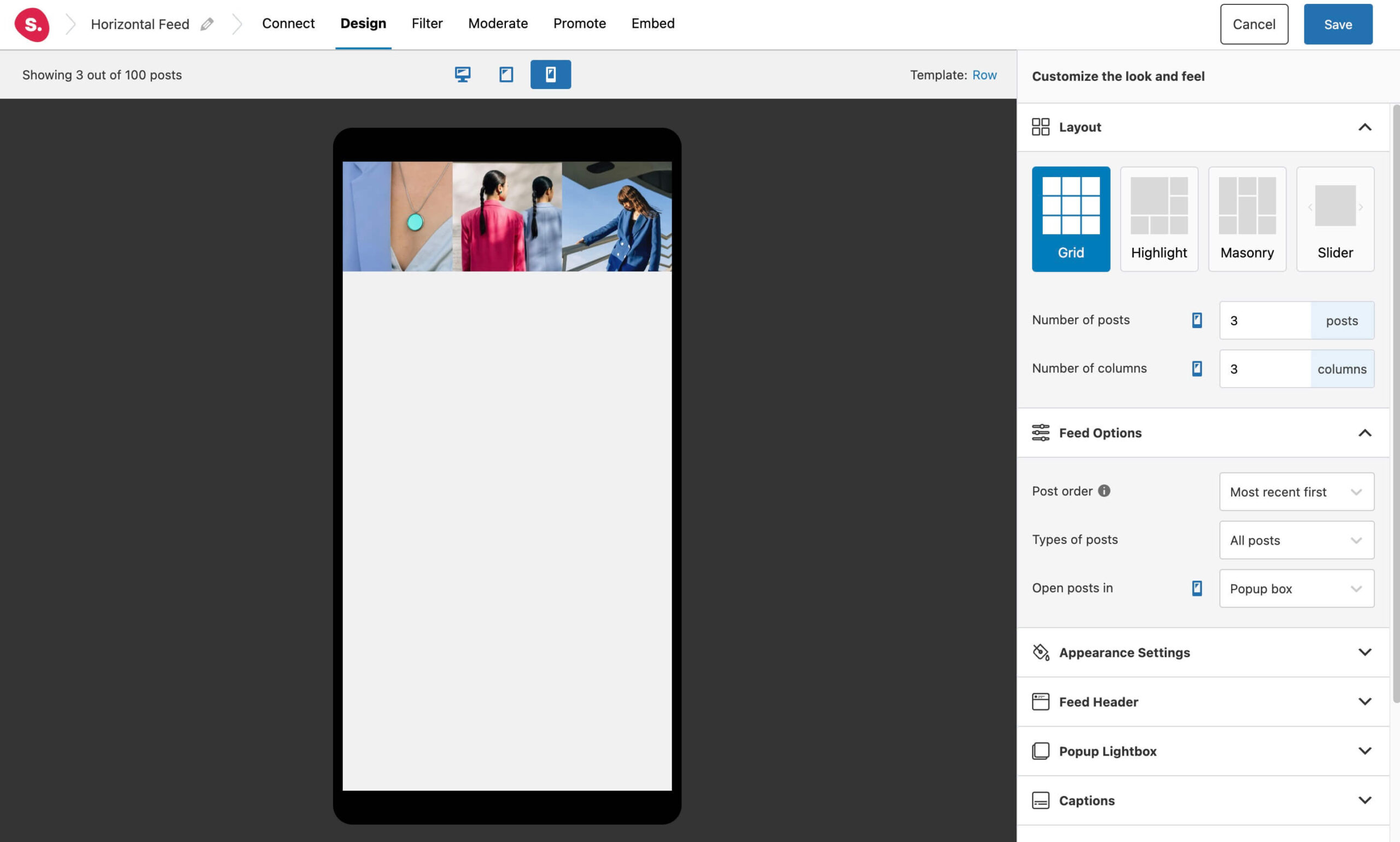
It’s important to ensure your horizontal Instagram feed is responsive across all devices, including desktop, tablet, and mobile. Spotlight is fully responsive and offers customization options to ensure your feed displays perfectly on every device.
Not only do all the predesigned templates adapt to any screen size, but you can further adjust the settings to ensure a perfect fit for your website.
Further customization
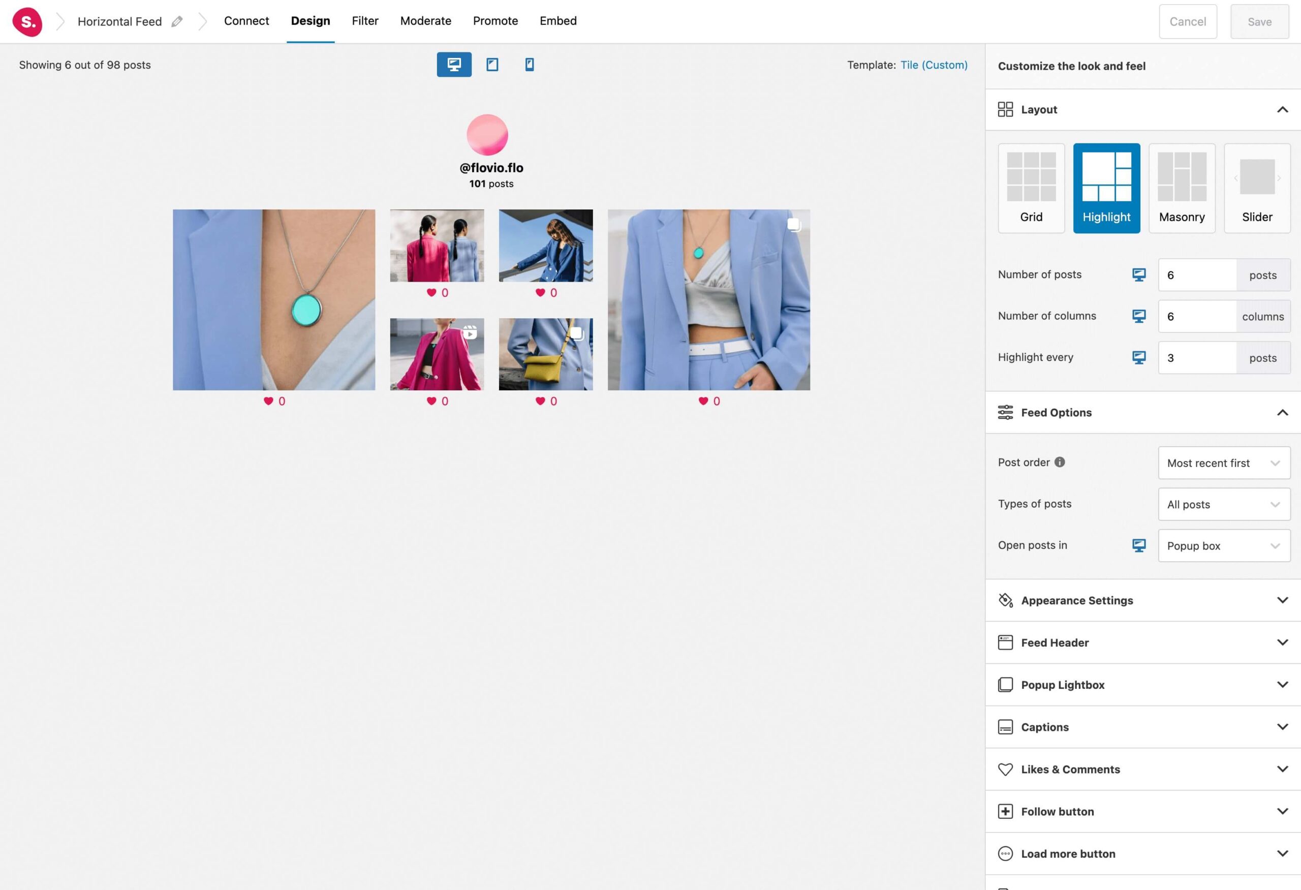
Apart from responsiveness settings, you are free to adjust over 40 customization options within Spotlight. These include the number of columns, posts, spacing, headers, and even the display of like and comment counts as can be seen in the example below:
Filtering and Moderation
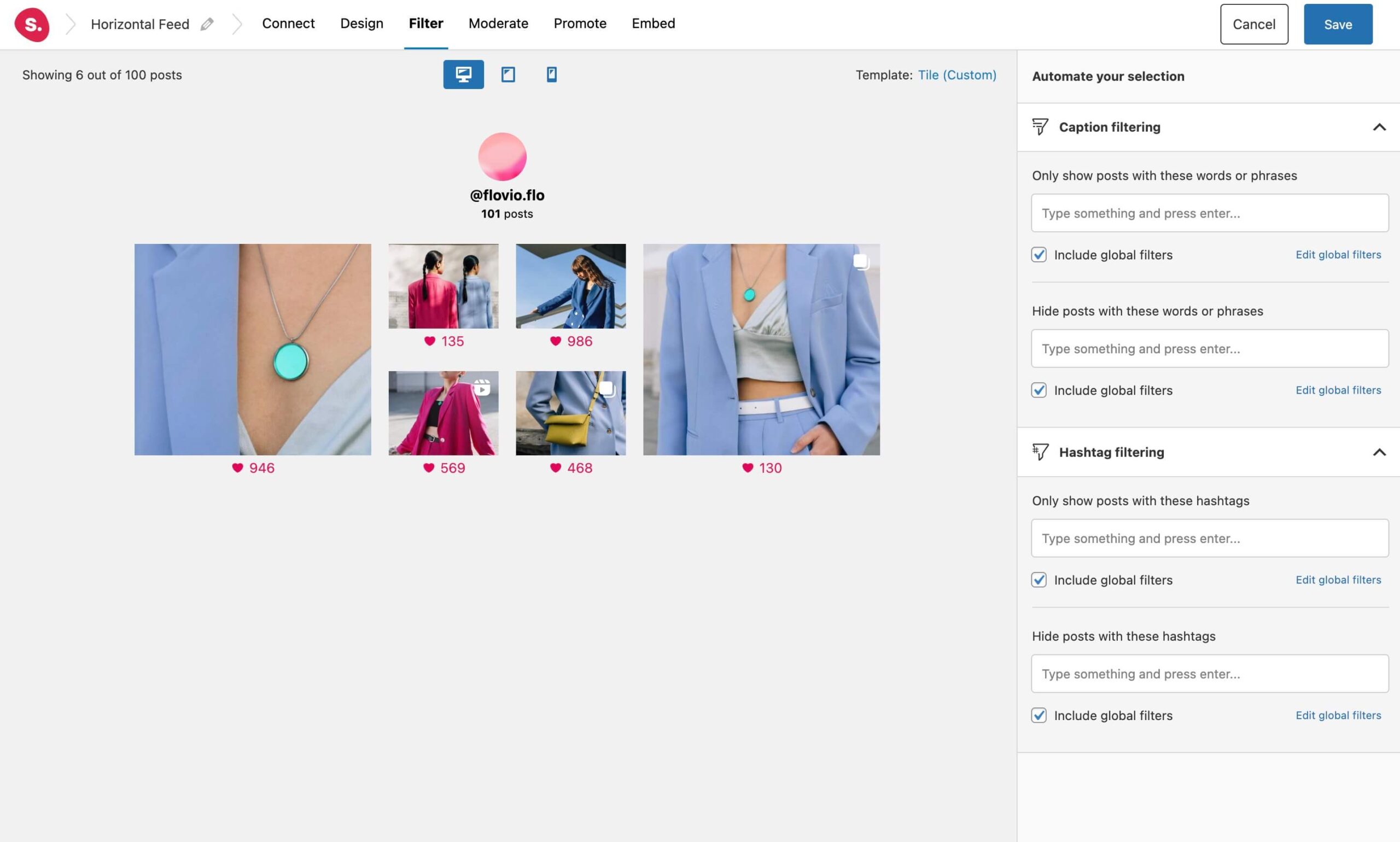
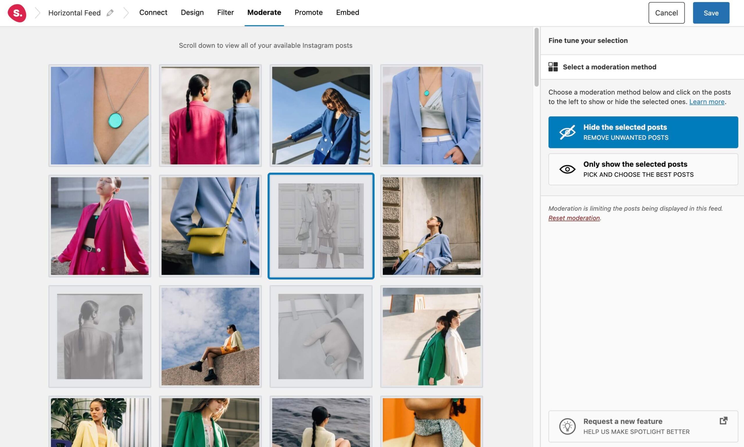
As mentioned above, filtering and moderation are easy with Spotlight. You can either filter by caption or hashtag or manually select the Instagram posts you want to hide or display in your feed.
Embedding your Instagram feed
Once you’re done customizing your feed, it’s time to embed it on your WordPress website. With Spotlight, you can do this in 3 ways:
- Using the dedicated block in the Block Editor,
- Using the shortcode,
- Using the Elementor widget.
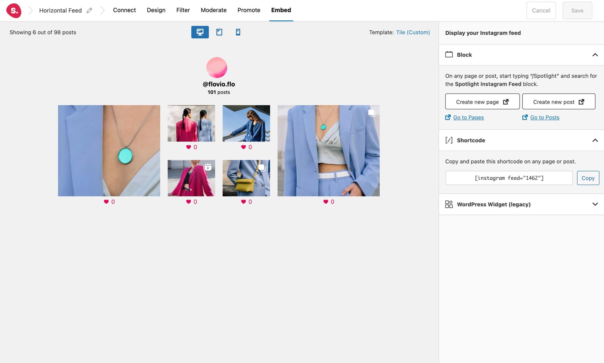
Displaying a horizontal Instagram feed in WordPress
In conclusion, choosing the right layout for your website is an important decision that can have a significant impact on your online presence. While there are many different layouts to choose from, each with its own advantages, it’s important to select a layout that aligns with your website’s goals and user needs.
Whether you choose a tile layout, carousel, wave, or row template, each layout can offer unique benefits that can help you improve the user experience, increase engagement, and drive conversions. By considering factors such as the type of content you will be displaying, the user’s browsing habits, and the overall design of your website, you can select a layout that will help you achieve your goals and stand out from the competition.
Ultimately, the key to success is to experiment with Spotlight‘s different templates, test their effectiveness, and make adjustments as needed. By staying up-to-date with the latest design trends and user preferences, you can create a website that is not only visually appealing but also functional and user-friendly.

