Spotlight v1.4 has been released this week and we’re excited to share our latest updates!
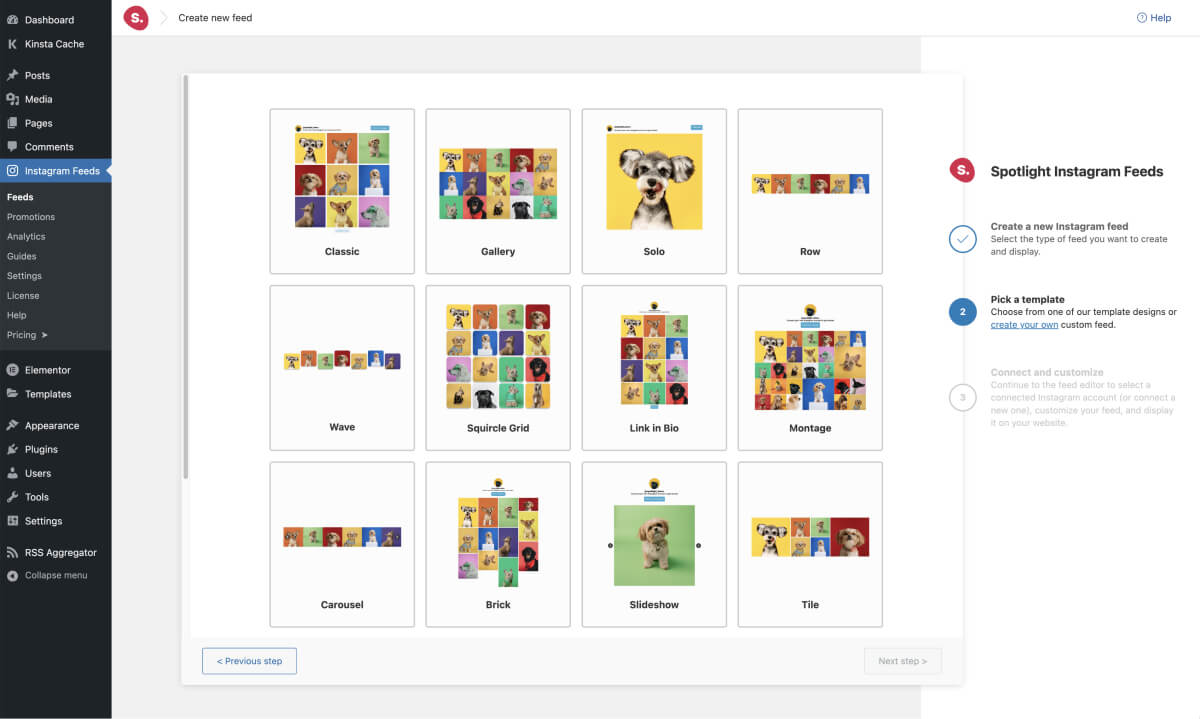
Back in June 2021, Spotlight was the first Instagram plugin to introduce templates. Since then, those templates have gone on to help tens of thousands of people quickly set up beautiful Instagram galleries on their websites.
In this update, we’ve taken things to a new level with unique template designs that you won’t find anywhere else!

Plus, for the code-savvy, you can even create your own custom templates with a little custom CSS. Keep scrolling down to learn more.
The Wave
Inspired by one of our very own Spotlight users, the Wave is a unique take on a simple row.
It’s a perfect fit as a separator between sections of a landing page or above the footer as a different form of a gallery, making your website and gallery stand out to site visitors.
It uses some custom CSS to achieve this look, all of which is pre-applied for you when you select the template. Wave is even fully responsive so we’ve designed it to look great on all devices.
A few clicks in the feed customization settings can create something even more unique like we’ve done below. Notice it’s now on 3 rows, 4 columns wide, and shows the caption on hover!
This doesn’t require any additional code – it’s a complete no-code solution. But there’s always the option to apply more custom CSS if you’ve got the know-how.
The Squircle Grid
The Grid layout was the starting point for Spotlight more than two years ago.
We’ve now introduced a fresh take with rounded corners and some simple shadows – Squircle Grid.
They’re minor changes but they give the Instagram feed a completely different look and feel that will stand out on any website. You can use it in your sidebar, as part of a hero section, or even on its own Gallery page.
Again, if you want to customize it further, some simple tweaks to the settings can give you a completely custom design of your own. Take a look at the example below where I’ve turned the squircle design into circles.
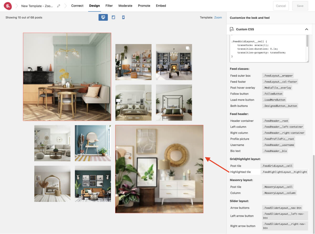
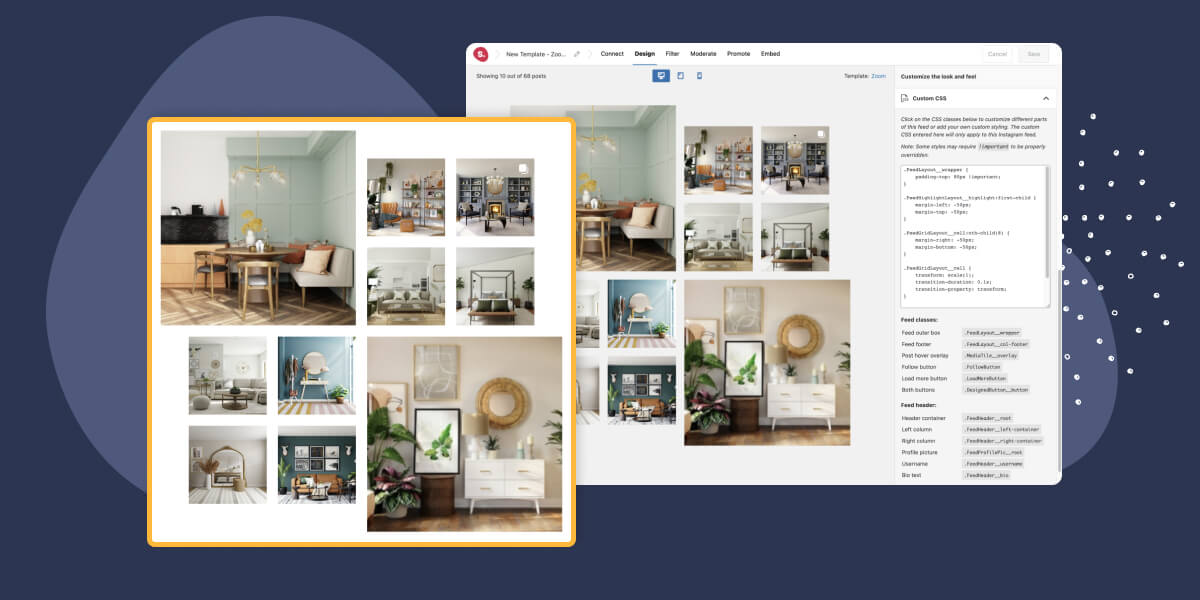
The Zoom (Premium)
Get creative with some out-of-the-box designs thanks to this cool Zoom template.
It’s nothing more than the Highlight layout that Spotlight has offered since day one, but something as simple as stretching out the two larger images in this configuration gives it a completely different look.
We loved customizing this one while we were designing it. In fact, here’s another configuration we came up with by just tweaking a few of the appearance settings.
The Portfolio (Premium)
As we gathered feedback for this template idea, one word which kept coming up was “Pinterest”.
The Portfolio template is the perfect way to showcase testimonials, products, blog articles, and so on, all using your Instagram posts.
One last time, here’s what a few minor customizations to this new template can create. Now imagine this showcasing your customer testimonials from Instagram for that ever-important social proof!
Custom CSS
All of the above is now possible with Spotlight’s new Custom CSS design option.
It’s available in “Design > Custom CSS” and even includes the CSS classes that Spotlight has available according to the layout and section of the gallery. This makes finding what to customize even easier!

Quick tip: Hover over each CSS class and Spotlight highlights the area in the preview that each class affects!

What’s Next?
We’re constantly working on new template designs and have a few more lined up to be released very soon. In the meantime, we’re constantly listening to user feedback for even more ideas.
Got a template idea in mind? Share it through our Template Request Form.
Want to submit a feature request? Submit a Feature Request Form.
It could be anything you want, from a cool gallery design for reels to a completely new feature.
Speaking of which, keep your eyes open in the coming weeks and months as we continue to make Spotlight the only Instagram gallery solution you’ll ever need for your WordPress site!


