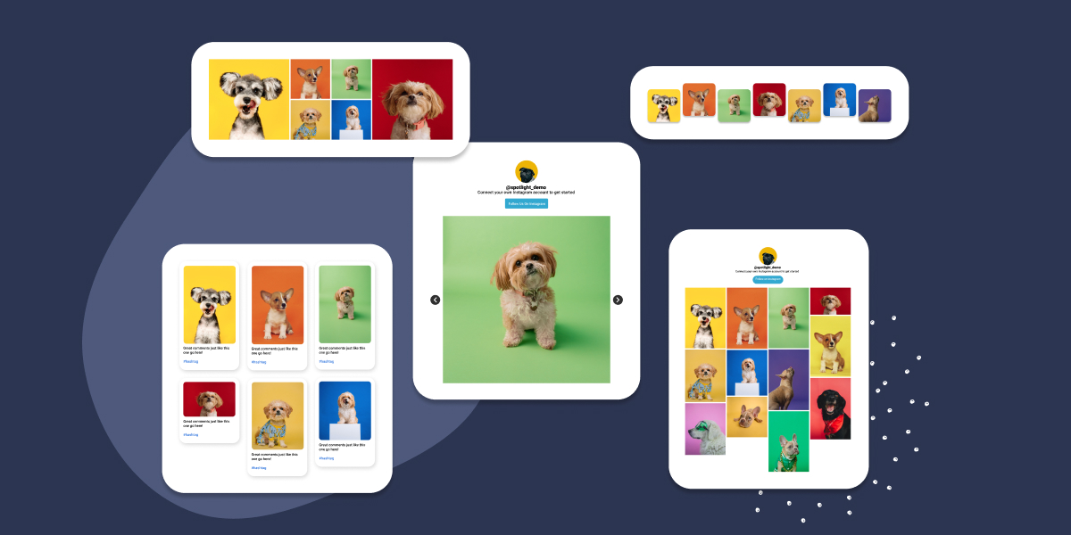
It’s more important than ever to create meaningful and engaging relationships with your website visitors and customers. Adding an Instagram feed on a website can really make a difference. When done well, embedding an Instagram feed into your website can make your website look more lively, keep content fresh, and connect with your visitors in a fun and engaging way.
In this article, we’ll discuss why it’s important to add an Instagram feed to your website, what makes it attractive, and show 5 examples to inspire you. We’ll also look at a few quick tips so you can get started today.
Why adding an Instagram feed to your website is important
Adding your Instagram feed to your website can have a big impact, and there are several great reasons why it’s worth doing. Let’s break it down in simple terms.
- Boosts engagement: When you display your Instagram feed on your site, it grabs attention. A visually engaging feed encourages visitors to stick around longer, scrolling through your latest posts. This can lead them to explore more of your site, which can increase interest in your products or services.
- Builds trust with social proof: When people see real-time posts from your Instagram on your website, it shows that your brand is active and engaged. It’s like saying, “Look, we’re real and people love what we do.” This helps visitors trust your brand more, which can ultimately lead to more conversions.
- Enhances visual appeal: Instagram is all about great visuals. Adding your feed makes your website more eye-catching and appealing. The colorful and creative posts from your Instagram can make your site feel more lively and interesting, leaving a better impression on visitors.
- Keeps your content fresh: One of the best parts about embedding your Instagram feed is that it updates automatically with your latest posts. This means your site will always have fresh content without you having to constantly add new material. It keeps your website dynamic and up-to-date, giving visitors something new each time they visit.
Spotlight has a full range of features allowing you to reap these benefits, including:
- Automatic updates: Your Instagram feed will always stay fresh with the latest content. There is no need to update it manually—Spotlight does it for you, keeping your feed relevant and timely.
- Customization options: You can easily adjust the look of your Instagram feed to match your brand’s colors, style, and overall vibe. It helps ensure that your feed looks great and aligns with your business’s aesthetics.
- Filtering: Want to highlight posts with a specific hashtag or tags? Spotlight lets you filter out content and focus on what matters most. You can control what shows up with tagged posts feeds or hashtag feeds, ensuring your audience sees your most engaging and interesting posts.
- Shoppable Feeds: Make it easy for your followers to shop directly from your Instagram feed. With Spotlight’s shoppable feeds feature, you can tag products in your posts, allowing users to click and purchase directly from your site, turning your feed into a seamless sales tool.
- User-generated content: With Spotlight, you can feature posts from your followers and customers, showcasing their experiences with your products or services. This adds authenticity and builds trust with potential customers.
- Actionable analytics: Track how well your Instagram feed is performing. Spotlight provides data on how your feed is driving engagement, so you can tweak your strategy if needed and make sure it’s helping you achieve your goals.
What makes an Instagram feed on a website attractive
Having an Instagram feed embedded on your website can be a powerful way to engage visitors, but what really makes it stand out? Let’s break it down.
1. Seamless design
The first thing people notice is how the Instagram feed blends with your website’s overall look. You don’t want it to feel out of place or like it’s been awkwardly stuck in. A well-designed feed should match the style and color scheme of your website, making everything look cohesive and professional. Most Instagram feed plugins, like Spotlight, offer customization options that allow you to tweak fonts, layouts, and colors, so your feed fits your brand perfectly.
2. Interactive features
Interactive elements can really take your feed to the next level. Imagine if visitors could not only look at your Instagram posts but also click on them to shop directly, or explore more links about what interests them. Shoppable posts and clickable links encourage visitors to engage more with your content, keeping them on your website longer and increasing the chances they’ll explore your products or services. These features make the Instagram feed not just attractive but functional.
3. Curated content
It’s not just about having a feed, but what is in that feed. You want to display Instagram posts that align with your brand’s identity and speak to your audience. Whether it’s behind-the-scenes shots, product highlights, or user-generated content, curating the right posts is key. With plugins like Spotlight, you can filter which posts appear in your feed, ensuring that only the most relevant and engaging content shows up. This makes your feed not only visually appealing but also meaningful to your visitors.
Examples of Instagram feed on website to inspire you
Let’s look at 5 examples from real brands to get your creative juices flowing.
1. Personalized gifts website showing Reels only content
Tresneria sells various items like fashion jewelry, hair accessories, and gifts. It also offers certain products that can be customized, like refrigerator magnets and printed cards. The company has chosen a Reels-based feed, which only features Reels instead of other content forms like video and image posts.
This approach not only showcases the products in action but also makes the website feel more interactive and lively. Reels often have a higher engagement rate, which helps keep visitors hooked and interested in seeing more. On the feed, you can see Reels showing what the products look like in person from a firsthand perspective, as well as some “behind the scenes” footage showing how customized items like magnets are made.
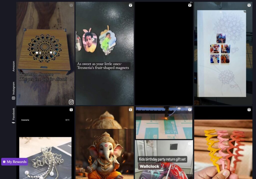
By using a Reels feed, Tresneria draws attention to the uniqueness of its products, showcasing the variety of offerings and allowing visitors to envision themselves as the ones holding and using the items.
2. Makeup website with shoppable content
Fenty Beauty by Rihanna is built on the idea of inclusivity. The brand offers a wide range of makeup products for every skin tone, from foundations to lipsticks. It’s a favorite because it truly delivers on its promise—beauty for all.
Fenty Beauty’s highlights this commitment on its Instagram feed. Reels showcase women applying different Fenty products, giving you a clear look at how they work on various skin tones.
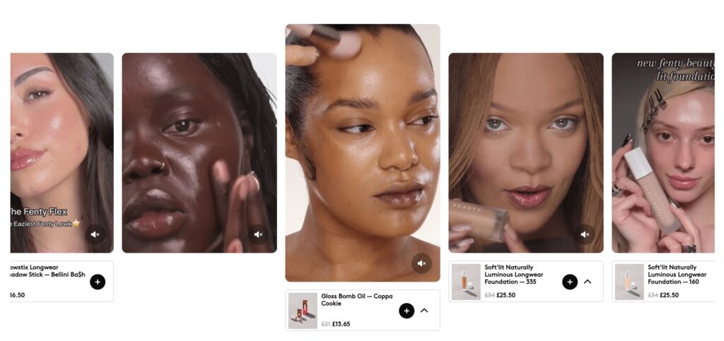
What really sets Fenty Beauty’s Instagram feed apart is its shoppable feature. Each Reel displays the price of the featured item, along with a plus sign that lets you add products to your cart instantly. This integration of engaging content with shopping options showcases how a well-designed Instagram feed can improve both the user experience and a brand’s bottom line.
3. University website showing posts, reels & captions
The George Washington University’s website pulls you into campus life through its Instagram feed. You’ll see posts, Reels, and captions that highlight everything from student achievements to daily events. It’s a glimpse into what’s happening on campus right now.
Reels and posts show real moments at GW—events, gatherings, and the buzz of campus life. Captions add the context, giving you the details that matter.

This feed is a great example of how to engage visitors by showcasing what makes your community unique. When planning your own site, think about how you can use these elements to make your content come alive.
4. Medical spa website showing graphic images and video content
Skinplicity Medical Spa provides services like filler injections, facials and treatments, hair restoration, microneedling, and more. Because these services are based around aesthetics and beauty, having a strong Instagram presence brings the brand huge benefits.
Through its Instagram, Skinplicity is able to showcase what it can offer. The feed includes a mix of various content: images and videos that announce specials and sales, give customer testimonials, and show “behind the scenes” photos and footage of real customers having procedures done. “Before and after” shots are especially effective, as it’s direct proof that their services do what they promise.

Skinplicity’s Instagram feed is a prime example of a comprehensive, informative, and engaging feed with consistent branding and visuals. Website visitors can get a feel for what it’s like to work with the team (and based on all the friendly smiles, it must be a positive experience!).
5. Payment solutions website with feed content
PAYARC is a payment solutions company that offers businesses a range of services, from secure transactions to customizable invoicing. It’s not every day you see a payments company using Instagram to engage with customers, but PAYARC is doing just that, and they’re doing it well.
Their Instagram feed doesn’t just promote their services—it’s a platform where they share insights, industry news, and highlights from events. Posts include everything from their CEO’s podcast appearances to updates from trade shows, giving followers a behind-the-scenes look at what makes PAYARC tick.
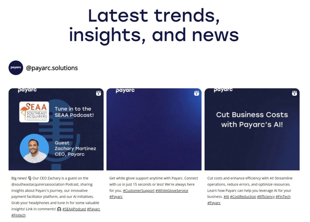
By using Instagram in this way, PAYARC connects with its audience on a personal level, making the technical industry feel a bit more approachable and engaging.
Quick tips for adding an Instagram feed to your website
Here are some things to keep in mind for your own embedded feed.
Consistency: Your Instagram feed should match the look and feel of your website. Think of it as an extension of your brand. Make sure the colors, fonts, and overall style align with your site’s design so that the feed complements your website rather than sticking out awkwardly. When done right, your feed will enhance the overall aesthetic, making your site look more dynamic and professional.
Functionality: Useful features like shoppable posts or hashtag feeds can drive conversions and increase engagement. Use a tool like Spotlight to add enhanced functionality and drive more business.
User experience: It’s important that your Instagram feed looks good and works smoothly on all devices, whether someone’s browsing on a desktop, tablet, or phone. Make sure you’re using a responsive tool (like Spotlight) that automatically adjusts the feed to fit any screen size. This way, you won’t have to worry about your feed looking distorted or not functioning properly on different devices. A smooth, consistent user experience is key to keeping visitors engaged.
Conclusion
Adding an Instagram feed to your website is a powerful way to engage visitors, build trust and credibility from your audience, and enhance the overall appeal of your brand. As seen in the examples above, different brands have found creative ways to meet their unique marketing and business needs — from showcasing products to sharing customer testimonials to providing peeks into daily life and experiences.
With these examples in mind, consider how an Instagram feed can elevate your own website. Try to brainstorm some creative ways that you can share your story and spark interest in your brand.
When you’re ready to get started, leverage tools like Spotlight, which helps you easily create customized Instagram feeds that integrate seamlessly and help your brand shine.

